Case Study — Action247
Action247
A free sports prediction game with real cash prizes. I designed the whole product to feel like a sportsbook without ever asking for a bet: from the lobby to the trophy, on phone, desktop and email.
- Client
- Action247 · Free-to-play sports prediction (Tennessee, US)
- Year
- 2019
- Role
- Product design, UX and UI, end to end
- Platform
- Phone, desktop and email
- Context
- Legal sports contests in Tennessee, no wagering
Action247 is a free sports prediction game in the US. Players pick who wins the fight, how many rounds it goes and the method of victory, and compete for cash prizes without betting a cent. The challenge was to give the thrill of a sportsbook to people who aren’t betting.
I designed the product end to end: the lobby, the pick, sign-up, results, the desktop version and the emails. Every screen has one job, and they all share the same green system, from phone to inbox.
What I did
01 — Decision: the lobby
The home sells one game at a time
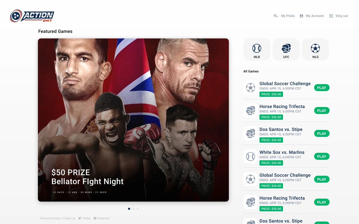
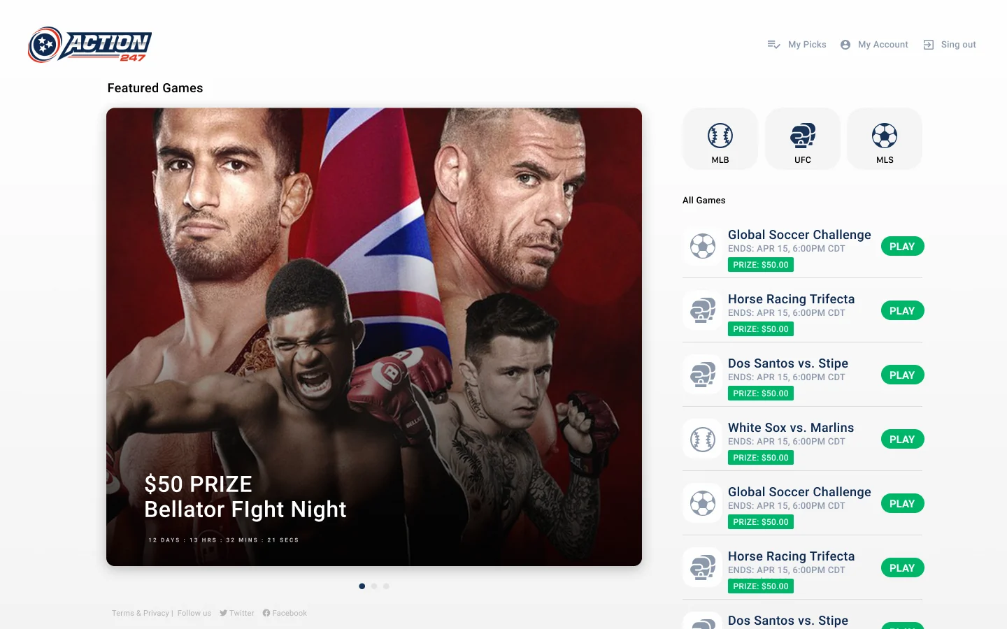
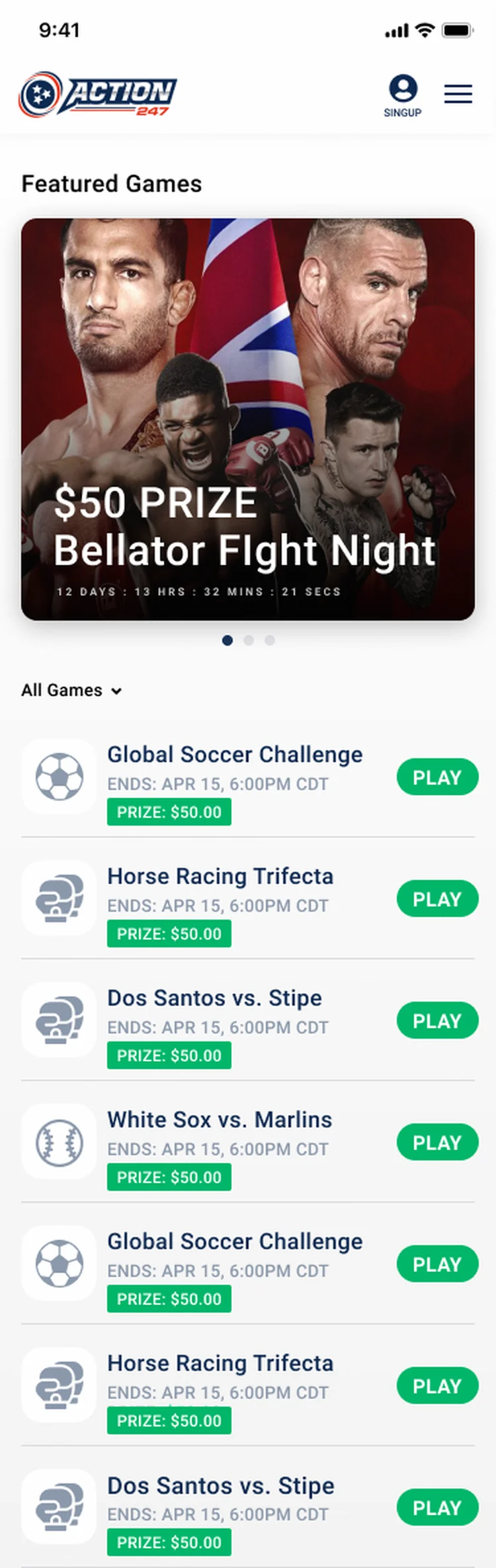
People open the app to play, not to read. So the top shows a single featured contest with its prize and a countdown: “$50 PRIZE · Bellator Fight Night”. Below it sits the list of games by sport, each with its prize and one green PLAY button.
On desktop the featured contest sits on the left and the list runs beside it. It keeps the energy of a sportsbook and stays easy to read.
02 — Decision: the pick
A few questions, each answered with one tap
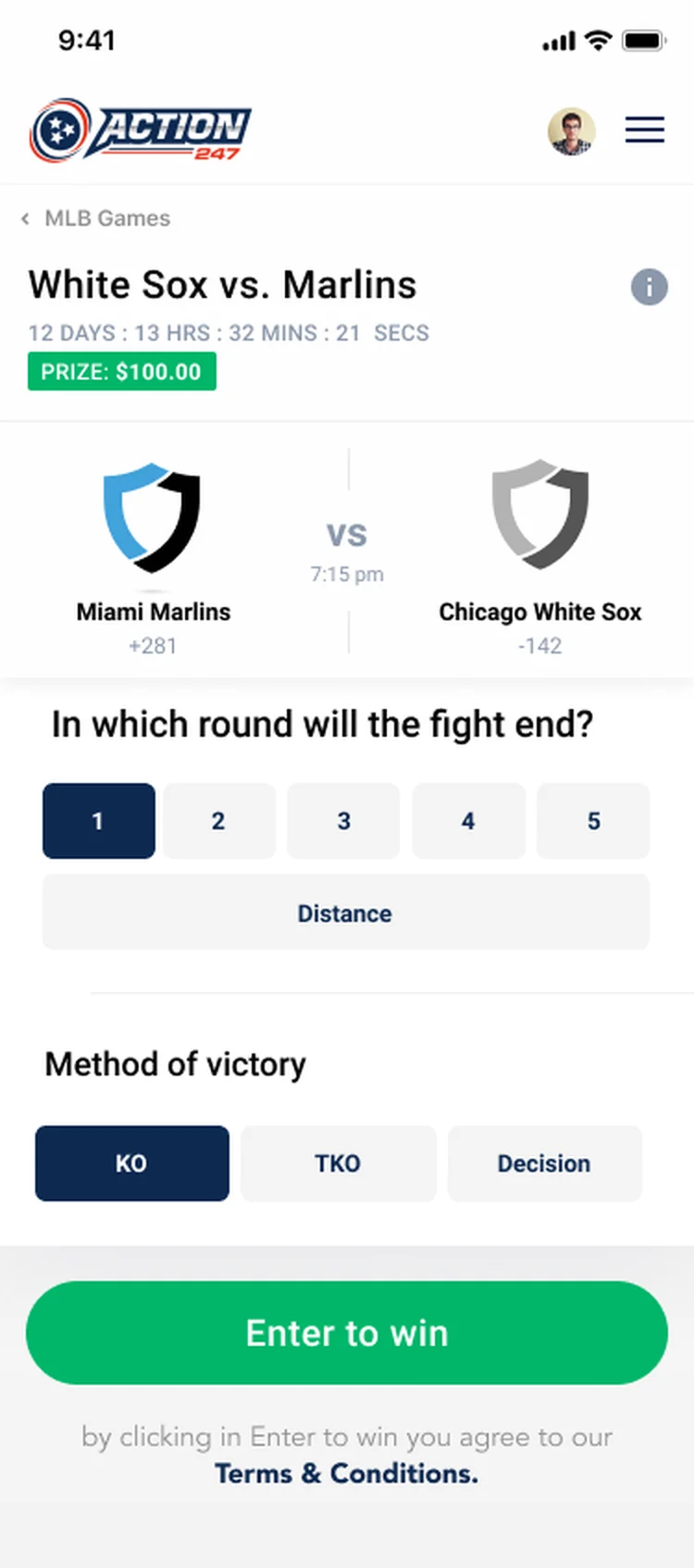
The pick is the heart of the product. Each contest asks only a few questions: who wins the fight, how many rounds, by what method. Answers are big tap targets with instant feedback, and it all ends in a single “Enter to win”.
Sign-up asks for the state first, because the contests follow Tennessee law. When the games end, the results screen pays off the wait: correct picks in green, misses in red, the points and a trophy. Then it invites you to the next round.
The loop on mobile
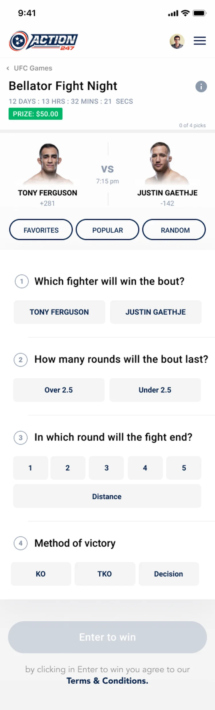
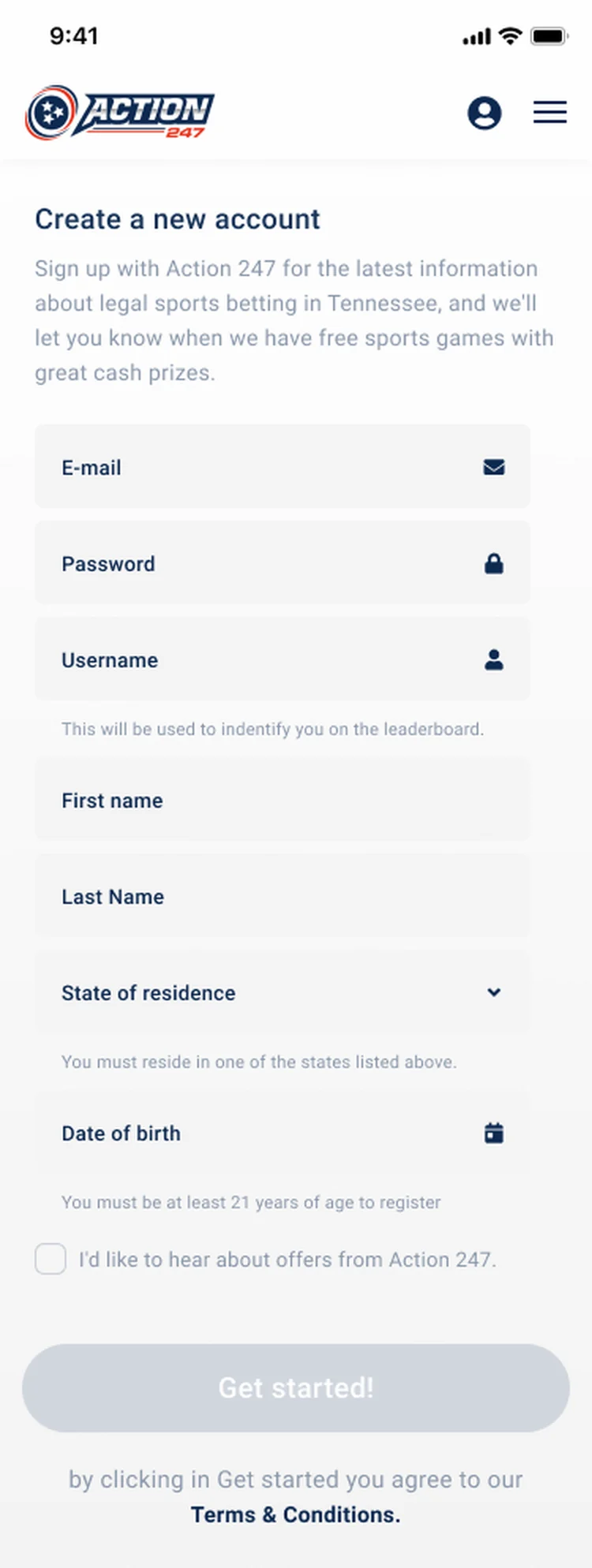
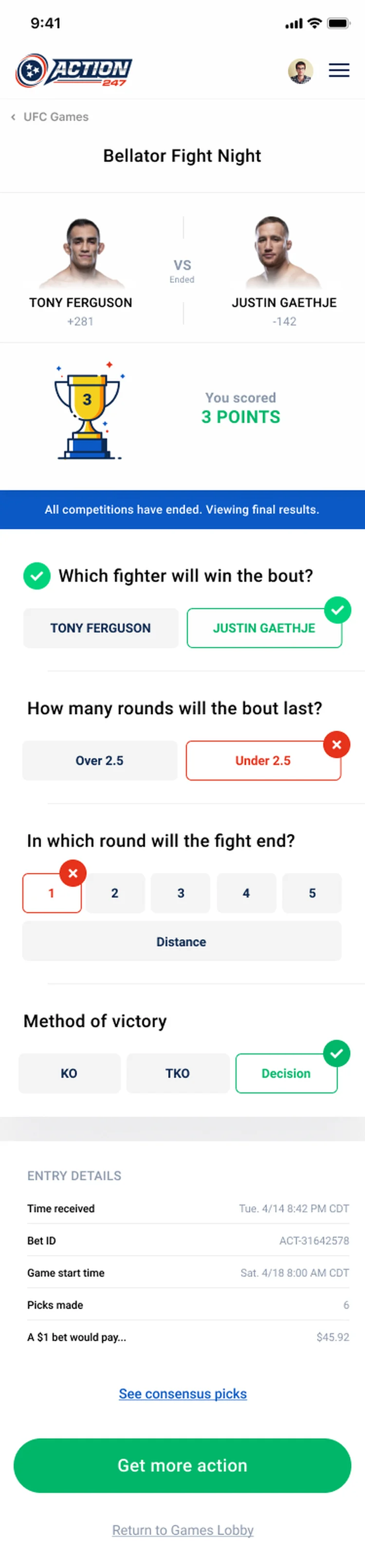
03 — Decision: one system
The email looks like the game it opens
Under the screens is one system: the green brand, the same card for every game, odds-style chips for the picks and type that reads well on phone and desktop. A new sport slots in without redesigning anything.
The email templates use the same components. A “Play the Free Weekend Trifecta” lands in the inbox looking like the product and takes people back to the lobby.
Outcome
What the work delivered
- +The thrill of a sportsbook in a free game, with no money at risk
- +The whole loop designed: lobby, pick, sign-up and results
- +The same experience from phone to desktop
- +A component system that takes new sports without a redesign
- +Emails that look like the product and bring players back
Tools
Got a product that needs people to come back?
I design the whole product, from the first tap to the email that brings people back.