Case Study — GPB · Finance system

GPB: a business group’s finance desk, from Access to the phone

GPB is the finance system of a Brazilian business group, replacing an old MS Access setup. The finance staff use it every day: payables and receivables, bank reconciliation, cash flow, month-end close and taxes. I ran the UX round straight in the code. The app below is GPB itself in demo mode: click around.

Client
GPB, a Brazilian business group
Year
2026
My role
UX and design engineering, in the React code
Status
Round delivered for review
Where
Desktop and phone, 360 to 1440 px
View on
Full screen
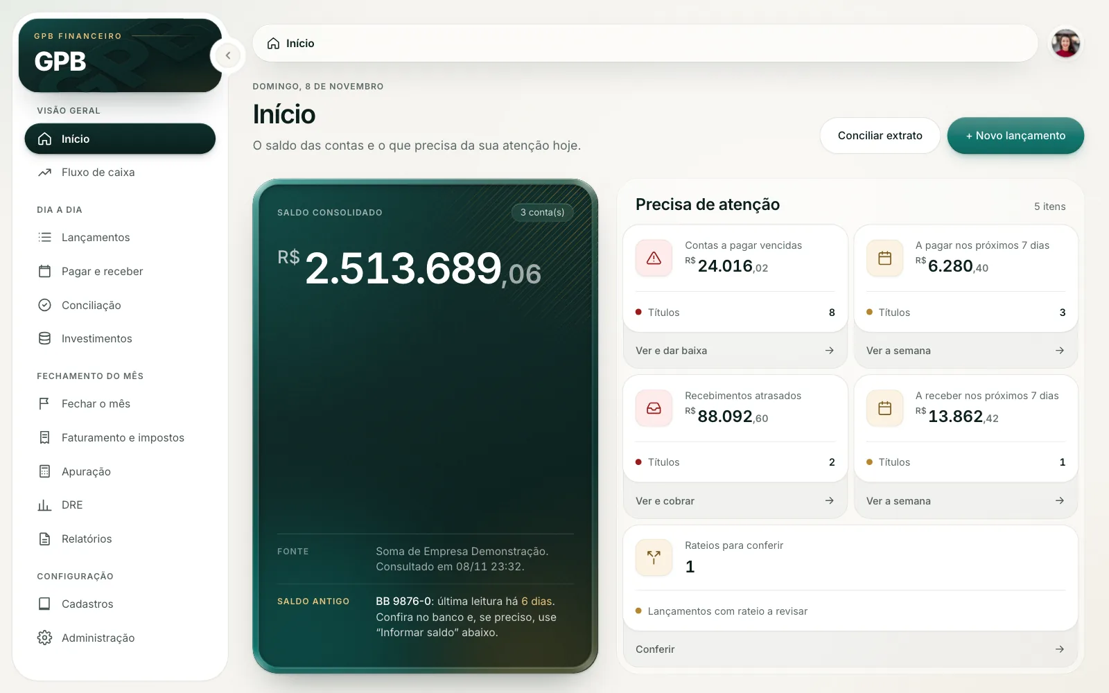
GPB’s home on desktop, loading the app

This is the real app, with fictional data generated in your browser: you can post entries, settle and reconcile. Nothing leaves the page, and reloading starts over. The interface is in Portuguese, as it is for the team.

Names, amounts and accounts are made up.

Screens

01 — The problem

Twelve identical tabs and no priorities

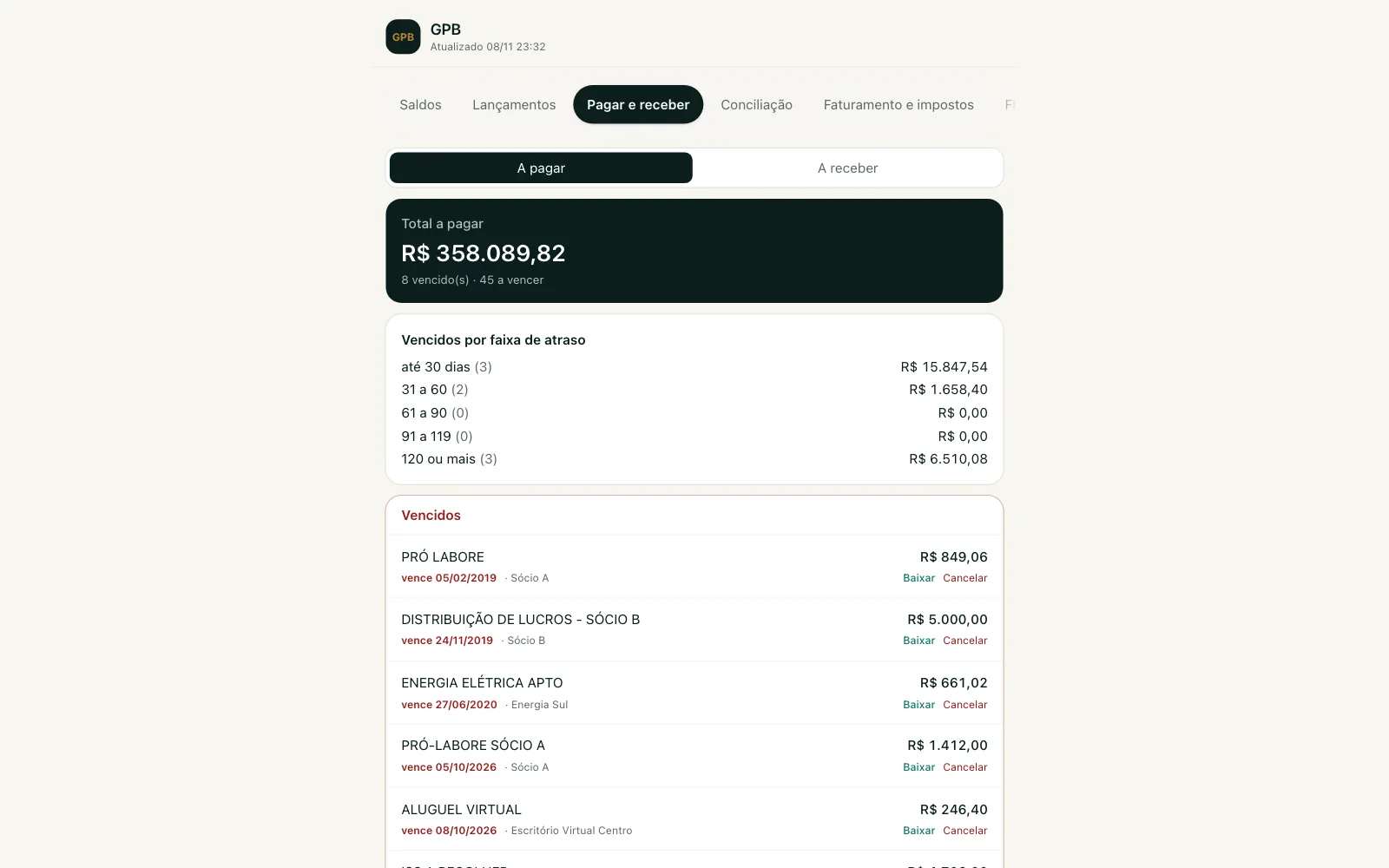
The first web version rebuilt Access screen by screen: twelve loose tabs in a strip that scrolled sideways, a column locked at 672 px even on a large monitor, and every form sliding up from the bottom, on desktop too. No screen said what needed attention today.

The people using it work in finance, not tech, posting and reconciling all day. Entries opened on "everything", with thousands of items inherited from Access (some open since 2015). The rule for the round: usability over flourish, and every change is measured in clicks and doubts for the day’s task.

ResearchNo. 01
11–23 s

To open Entries, downloading everything again on every tab switch. Now it loads once and the other screens use it right away.

GPB UX analysis, November 2026

02 — Before and after

Same data, a different read

The same fictional data in both versions. What changes is the order: first what needs action, then the rest.

01 — On desktop

What improves: The whole screen at work

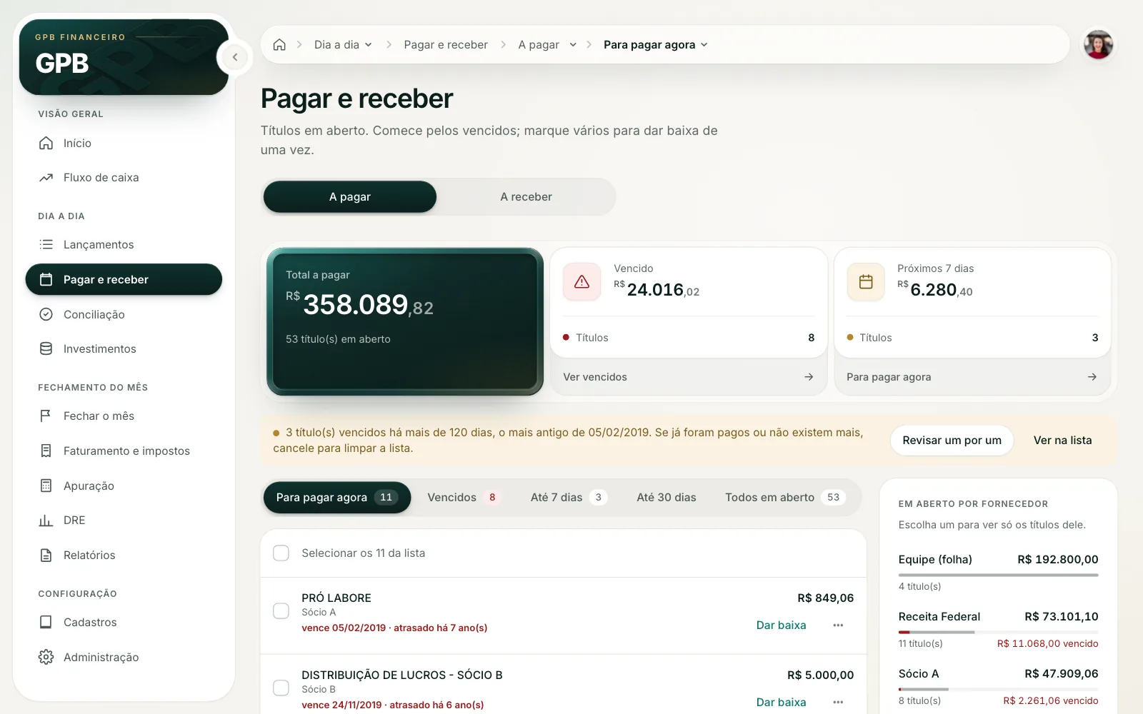
The menu moved to the side and is grouped by task: Overview, Day to day, Month-end close and Settings. Payables opens on "Pay now", with the total, overdue and next 7 days above the list, and a notice about old items with a button to review them one by one.

HeuristicNo. 01

Visibility of system status

People see what is going on before they have to ask.

Nielsen Norman Group · 10 Usability Heuristics
Before
Payables before, at 1440 px: loose tabs at the top, a narrow column in the middle of the screen and the overdue list with Settle and Cancel links
After
Payables after: grouped side menu, a strip with total, overdue and next 7 days, a notice about items overdue for 120+ days and the list with bulk actions

02 — On the phone

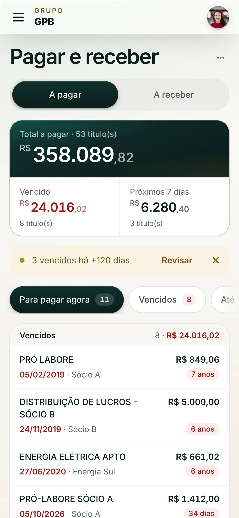
What improves: Feels like an app

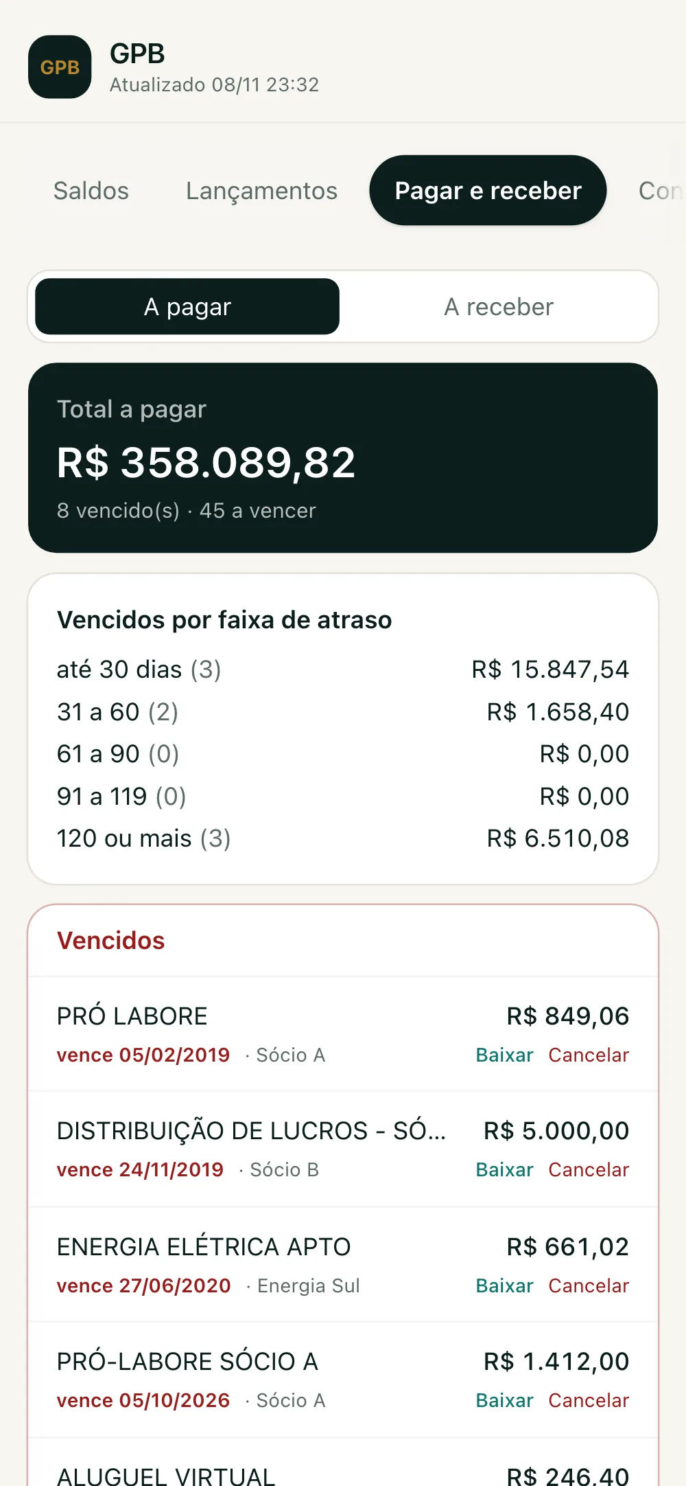
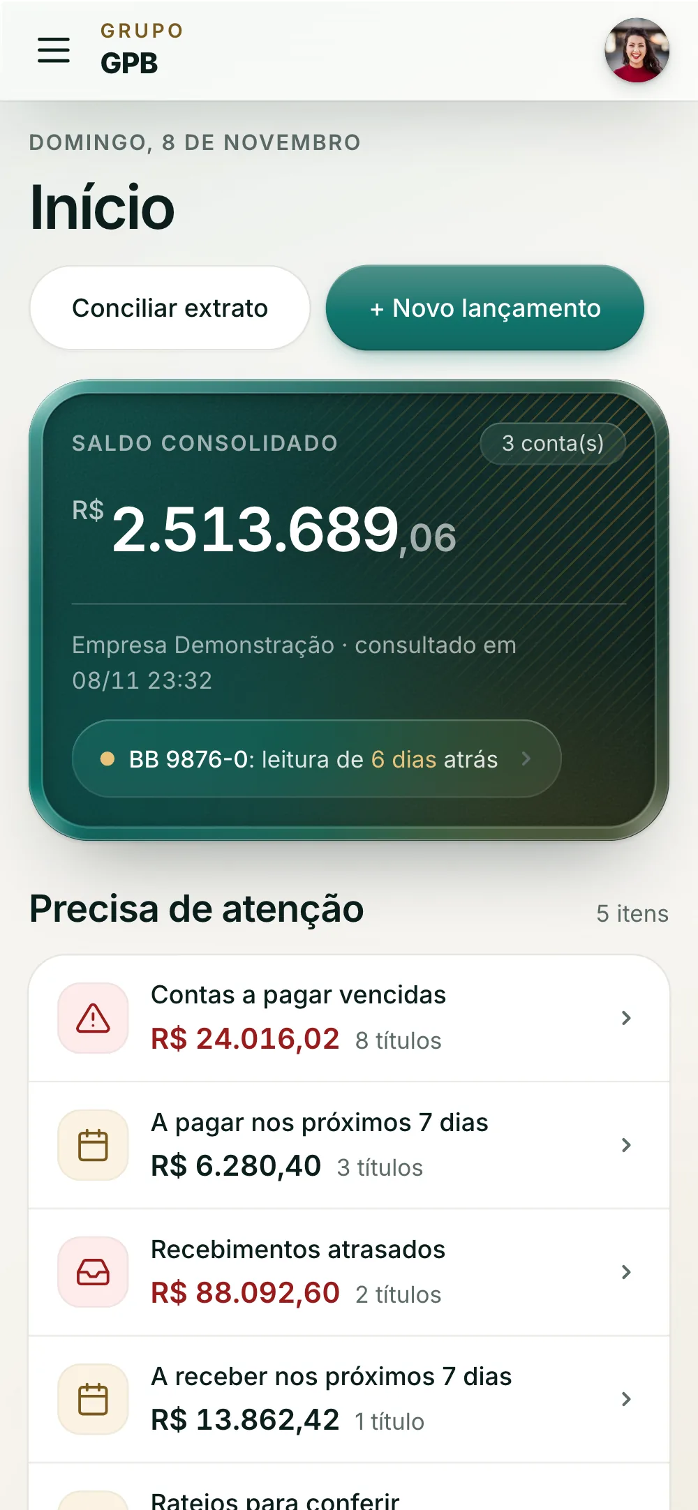
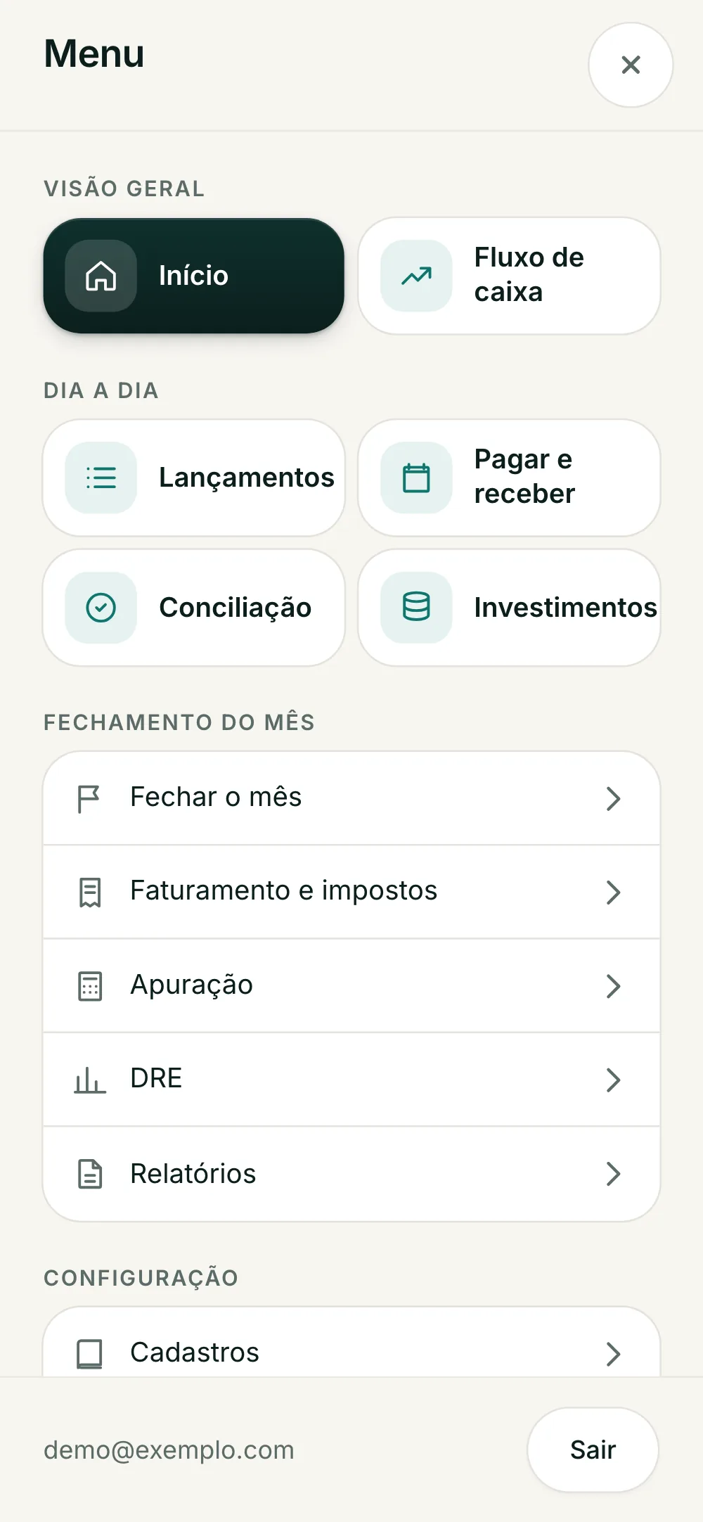
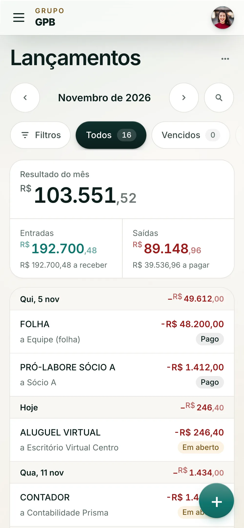
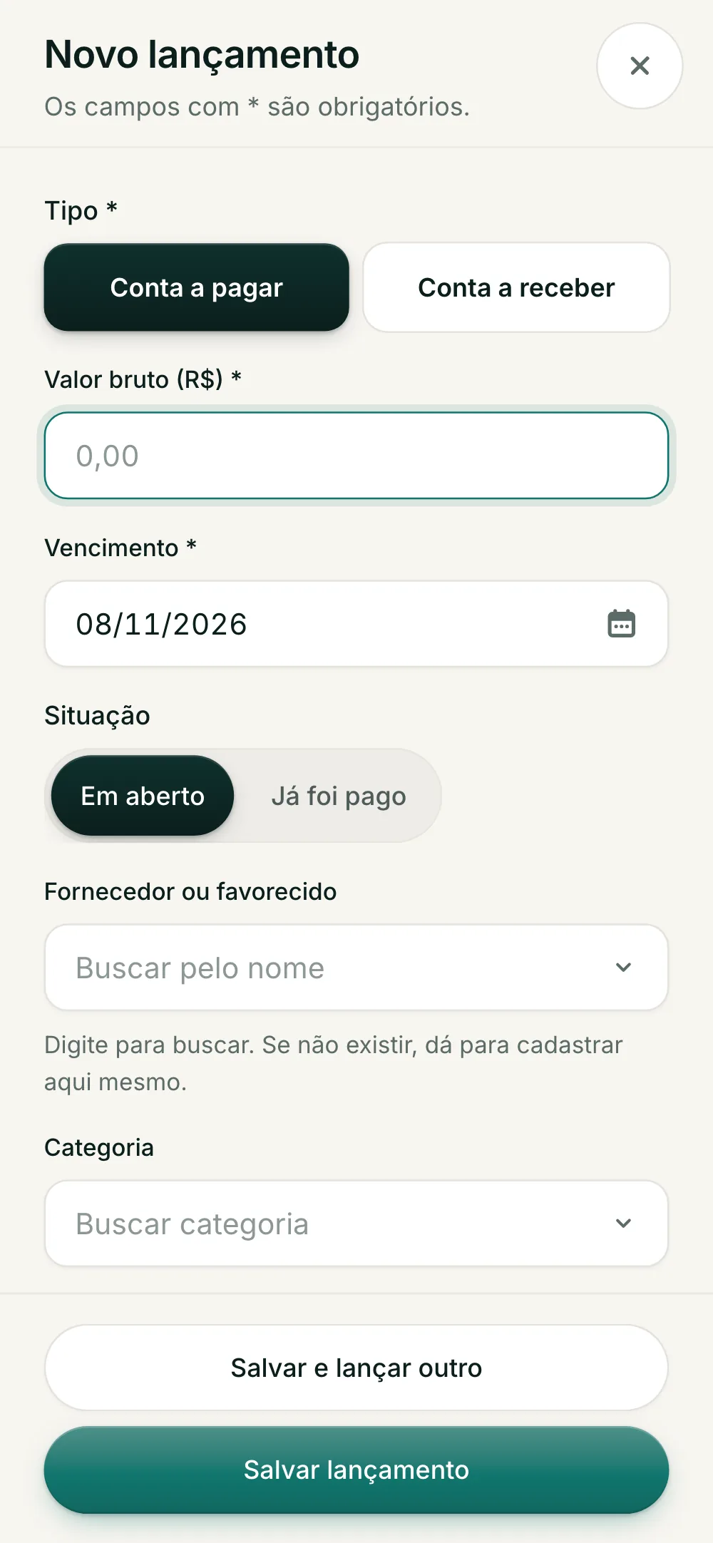
The sideways tabs became a ☰ menu: the daily routine as cards, month-end and settings as a list. Forms and alerts open as bottom sheets or full screen, never in a cramped modal.

ResearchNo. 02
44 × 44 pt

Is the recommended minimum touch target. On GPB, every target on the phone is at least that.

Apple · Human Interface Guidelines
Before
Payables before, at 390 px: a tab strip cut off at the edge and the same column as on desktop
After

03 — Decisions

Guided processes instead of loose screens

The right tool for each task: a wizard for work with a start, an end and several decisions in order; a checklist for a cycle that spans several screens; triage for a queue of similar items; and a quick form for what people do with their eyes closed.

See the triage live

HeuristicNo. 03

Error prevention

Better than a good error message is a design that keeps the error from happening.

Nielsen Norman Group · 10 Usability Heuristics
01 — Triage, one at a timePayables
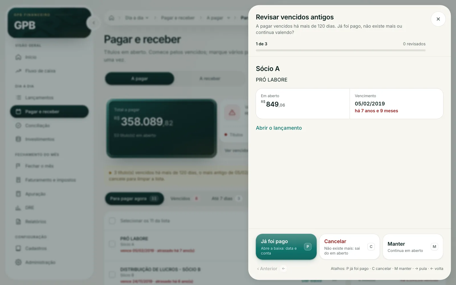
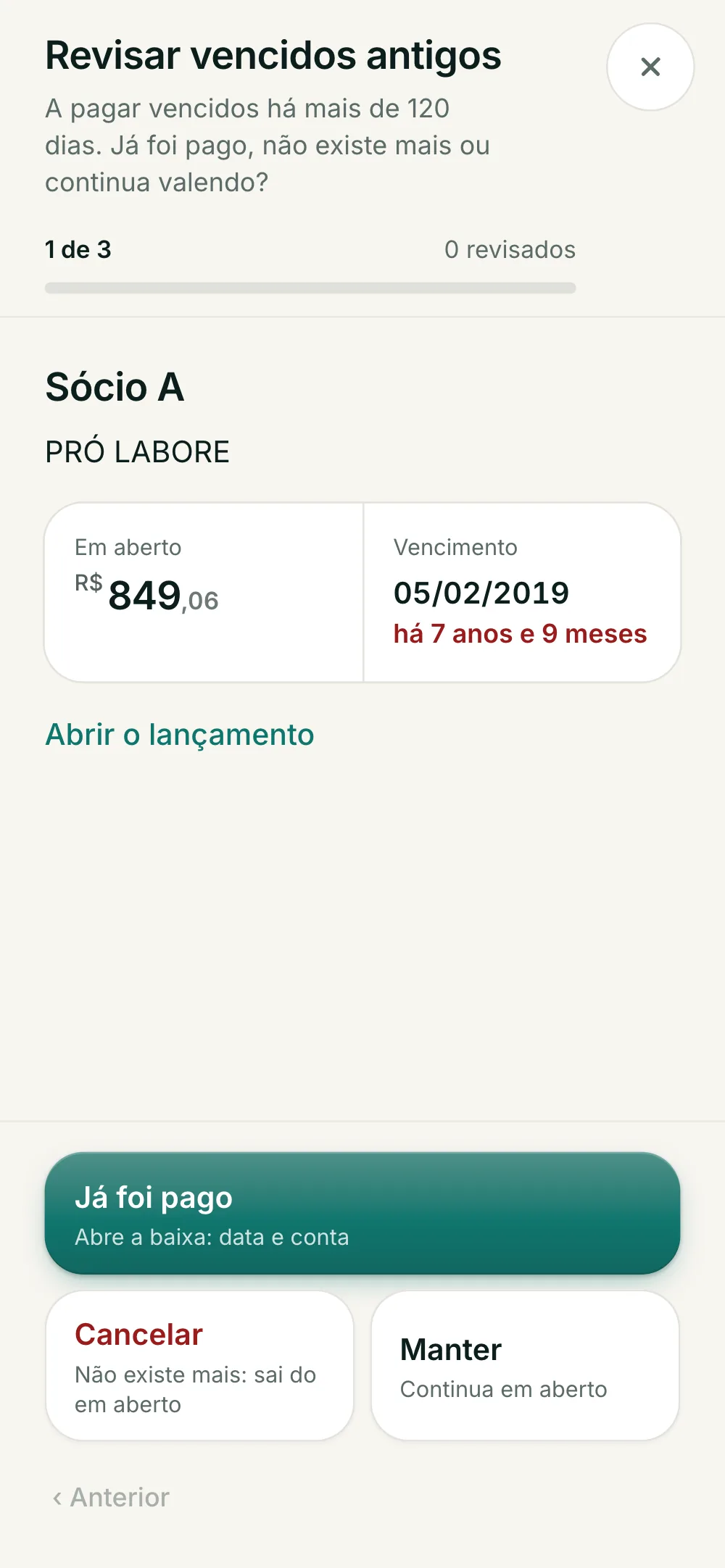
Review old overdue items: one item at a time, with amount, due 7 years ago and three ways out, Already paid, Cancel and Keep, with keyboard shortcuts
Items overdue for more than 120 days leave the list and enter a queue: already paid, cancel or keep. Shortcuts P, C and M, and undo in the toast.
02 — Side-by-side panelsPanel stack
"Already paid" opens the settlement next to the triage, which slides over and stays in view. It is posted as a management settlement on the due date: it clears the item without creating a bank outflow.
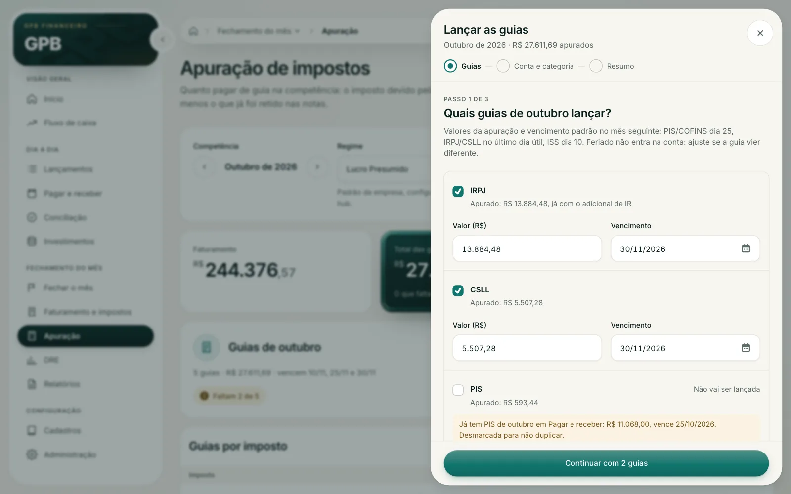
03 — Tax slips on the federal calendarTax assessment
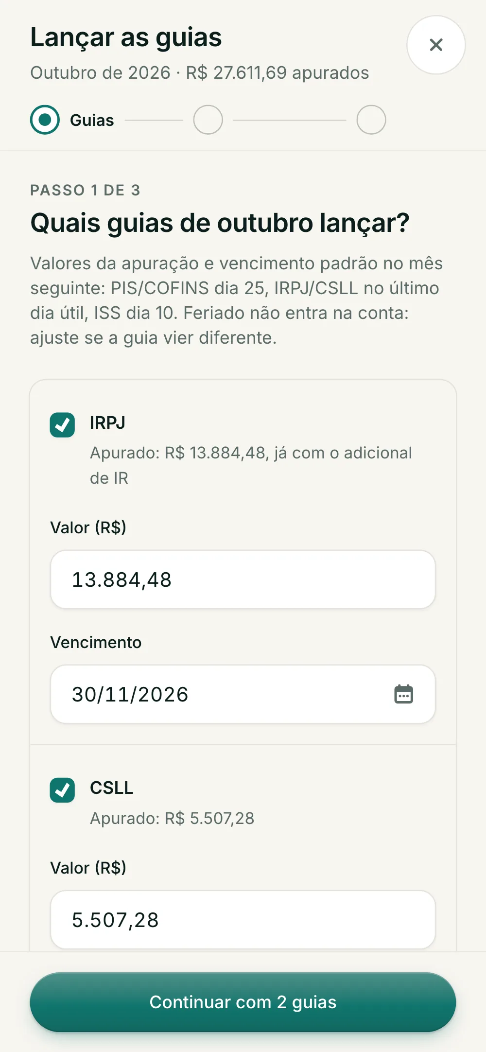
Post the tax slips wizard, step 1 of 3: IRPJ and CSLL checked with amount and due date, and PIS unchecked because it is already posted
The assessment computed the tax and stopped there. The wizard posts each slip with its due date (PIS/COFINS on the 25th, IRPJ/CSLL on the last business day, ISS on the 10th), shifts weekends and unchecks what is already posted.
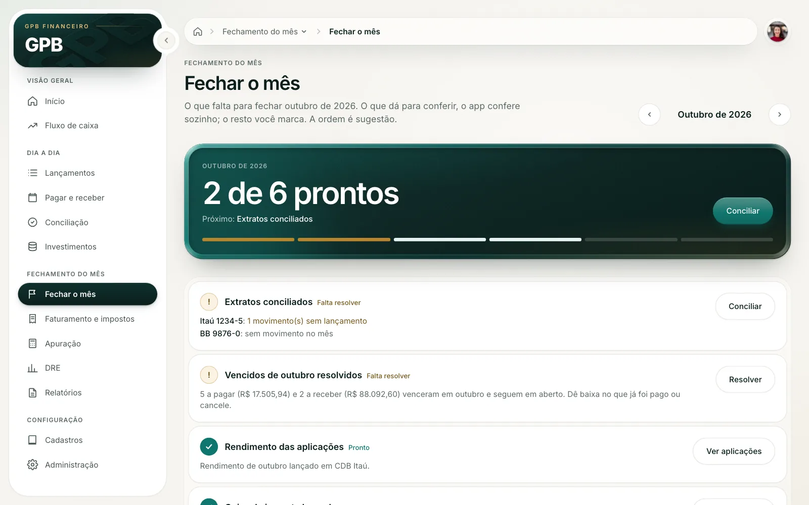
04 — Close the monthChecklist
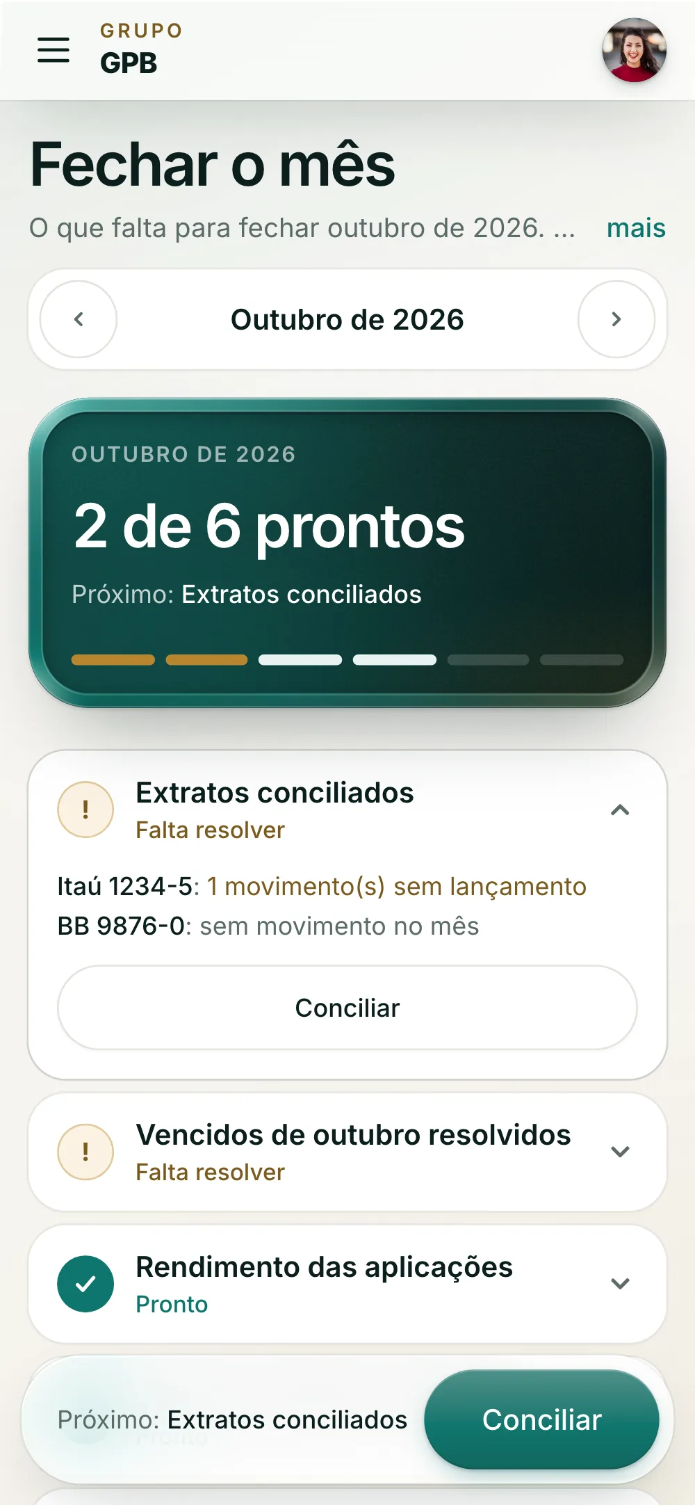
Close the month: 2 of 6 done, the next step highlighted and the list with statements, overdue items and yields, each with its status
Six steps that check themselves: reconciled statements, overdue items resolved, yields, tax slips, P&L and reports. The order is a suggestion, and each row opens the right screen.

04 — On the phone

An app in your pocket, no sideways scroll

A round just for responsive: modals became bottom sheets or full screens, the ☰ opens the routine as cards, and a phone kit went into every screen (a numbers strip, lists grouped by day, a fixed action bar and the + button). From 360 to 1440 px, none of the 13 screens scrolls sideways.

See the phone live

HeuristicNo. 04

Jakob’s law

People expect a system to work like the apps they already use every day.

Nielsen Norman Group · Jakob’s law

Delivery · Design engineering

Designed straight in the code

No Figma in between. I read the 13 screens in the code, wrote the analysis, and each decision went straight into the product’s React, on a branch, in commits by topic, with the tests passing.

To review without touching production, the app got a demo mode with fictional in-memory data. That is what runs at the top of this page.

  1. 01

    Analysis before screens

    13screens read in the code and mapped

    Each screen was tied to the Access function it replaces, with who uses it, how many clicks the daily task costs and the problems by severity. The round started from that list, not from taste.

  2. 02

    A kit, not loose screens

    5new pieces for the phone

    KpiStrip, GroupedList, ParamSummary, BottomActionBar and Fab joined the shared kit, next to the bottom sheet, the wizard, the triage and the panel stack. Every screen uses the same pieces and behaves the same way.

  3. 03

    Measured responsive

    0 pxof sideways scroll, 360 to 1440 px

    A Playwright script walks the 13 screens at several widths and measures sideways scroll, type under 12 px and targets under 44 px. Whatever showed up became a task, until the list was empty.

  4. 04

    Ready for review

    77commits by topic, on a branch

    Every change has a commit with the why, and the decisions that depended on the client stayed flagged in the code until they were settled, one by one. Merging is the reviewer’s call.

Outcome

What is done

  • Task-grouped navigation and a Home that shows what needs attention today
  • Wizards to reconcile, post tax slips, close the month for investments, import spreadsheets and set up a company
  • Month-end close as a self-checking checklist, and triage of items overdue for more than 120 days
  • Side-by-side stacked panels on desktop; bottom sheets and full screens on the phone
  • A phone kit used across the 13 screens, with no sideways scroll from 360 to 1440 px
  • A demo mode with fictional data, to review without touching production

Tools

  • React 18
  • TypeScript
  • Vite
  • Tailwind CSS v4
  • Motion
  • Vitest
  • Playwright
  • AI agents

Want to talk about this project?

I can walk you through the decisions and what is behind each screen.