Case Study — Finby

Finby

Saving up with friends, without spreadsheets or anyone chasing payments in the group chat. I designed the app and, on my own and in days, turned the file into a prototype you can use on a phone: 12 navigable screens, from invite to withdrawal.

Product
Finby · social consórcio among friends
Prototype
2026
Role
Solo, from the app in Figma to the prototype in code
Platform
iOS app · interactive web prototype
Scope
80 screens across seven flows, from sign-in to withdrawal
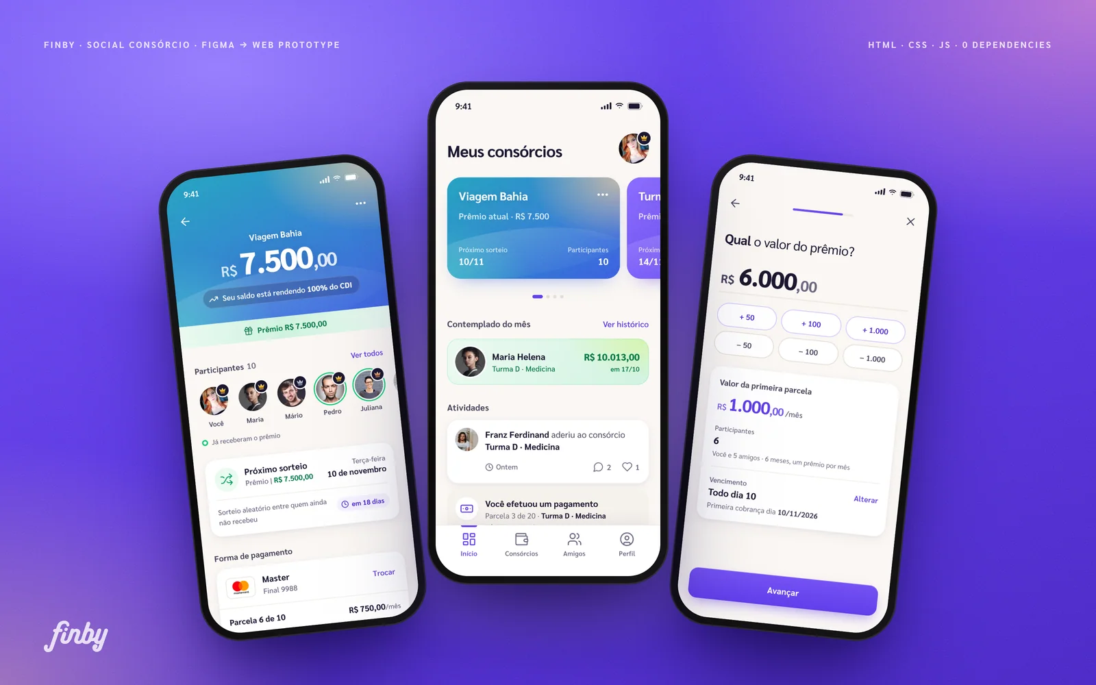
Three Finby screens on a grainy violet background: the Viagem Bahia consórcio, the My consórcios home and the prize amount step

A consórcio is a very Brazilian way of saving up: a group pays a monthly instalment into a shared pot, and each month one member takes the prize. Among friends it has always run informally, with one person tracking who paid and chasing whoever is late. Finby, which I designed, moves that agreement to the phone and takes the debt-collector role off the group.

But an 80-screen file can’t show whether the numbers add up, or what it’s like to invite someone who isn’t on the app yet. So I turned the design into a prototype you can use: 12 navigable screens, with the same flows and the states the file skipped. I did it alone, with AI agents on production and the product decisions staying with me, in days, not months.

What I did

Product designUI and interactionDesign systemArt directionAccessibilityUX writingFront-endAI agent orchestration
80screens I designed, across seven flows
12navigable screens, with an automatic tour
1person from design to prototype, with AI on production
2 in 1creation flows, private and public, in one wizard
6consórcio themes, picked at creation
AAcontrast where the file fell short

01 — The problem

Every group fund has someone stuck chasing payments

When friends save up for a trip or a graduation, someone becomes the treasurer. That person tracks who paid and chases whoever is late, usually in the group chat.

Finby puts that agreement in an app. You set the prize and the instalment and invite whoever you like. Who gets paid when comes from a random draw or an order everyone agrees on, and the money earns 100% of the CDI rate while it waits.

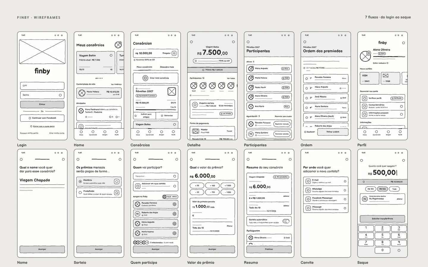
A mosaic of fourteen Finby screens as lo-fi wireframes: sign-in, home, consórcios, details, members, payout order, profile, the creation steps, invite and withdrawal
The seven flows as wireframes, from sign-in to withdrawal.

02 — The prototype

Try it before you read

It has 12 screens, and what you do is saved. Create a consórcio and it shows up on the home. Invite someone and they join as a pending sign-up. Or let the tour walk through the screens.

Jump to

Use it like a phone: create a consórcio, invite someone and reorder who gets paid. The data is fictional and stays in your browser. The interface is in Portuguese, as in the original.

Open full screen ↗

03 — Decision: hierarchy

Every screen starts with the payer’s question

Before any colour, I settled the order of information in wireframes. In an app about money among friends, people want to know how much they’ll pay and when their turn comes. Those answers come first on every screen, and the finish doesn’t change that order.

Wireframe
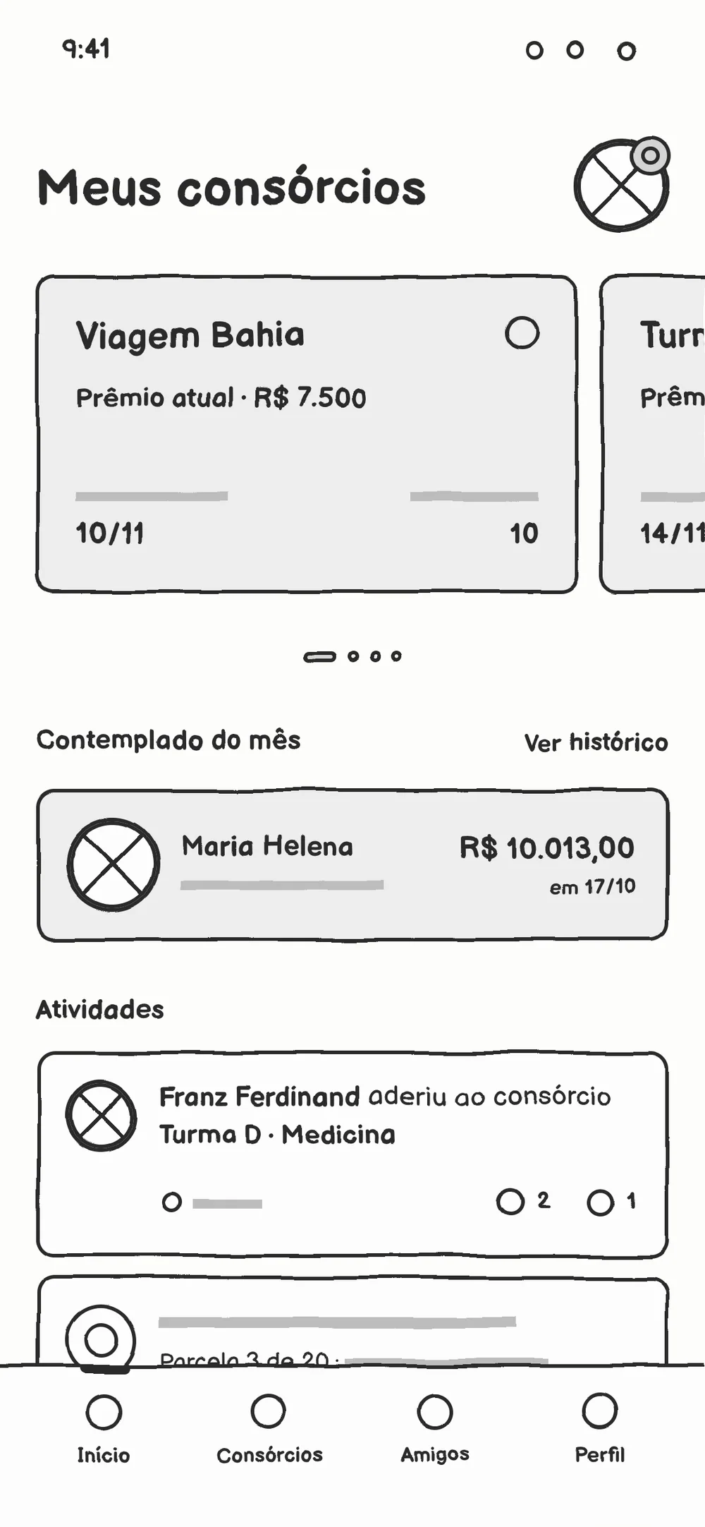
Home wireframe: My consórcios title, carousel cards, winner of the month and activity feed in black-outlined boxes
Prototype

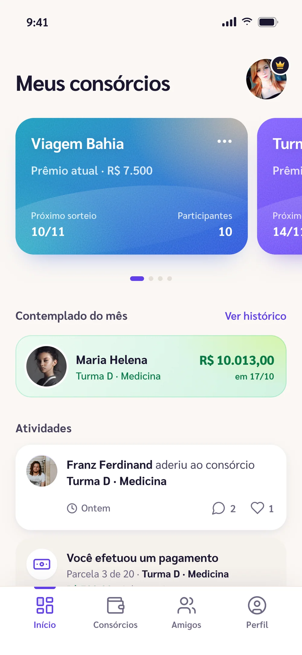
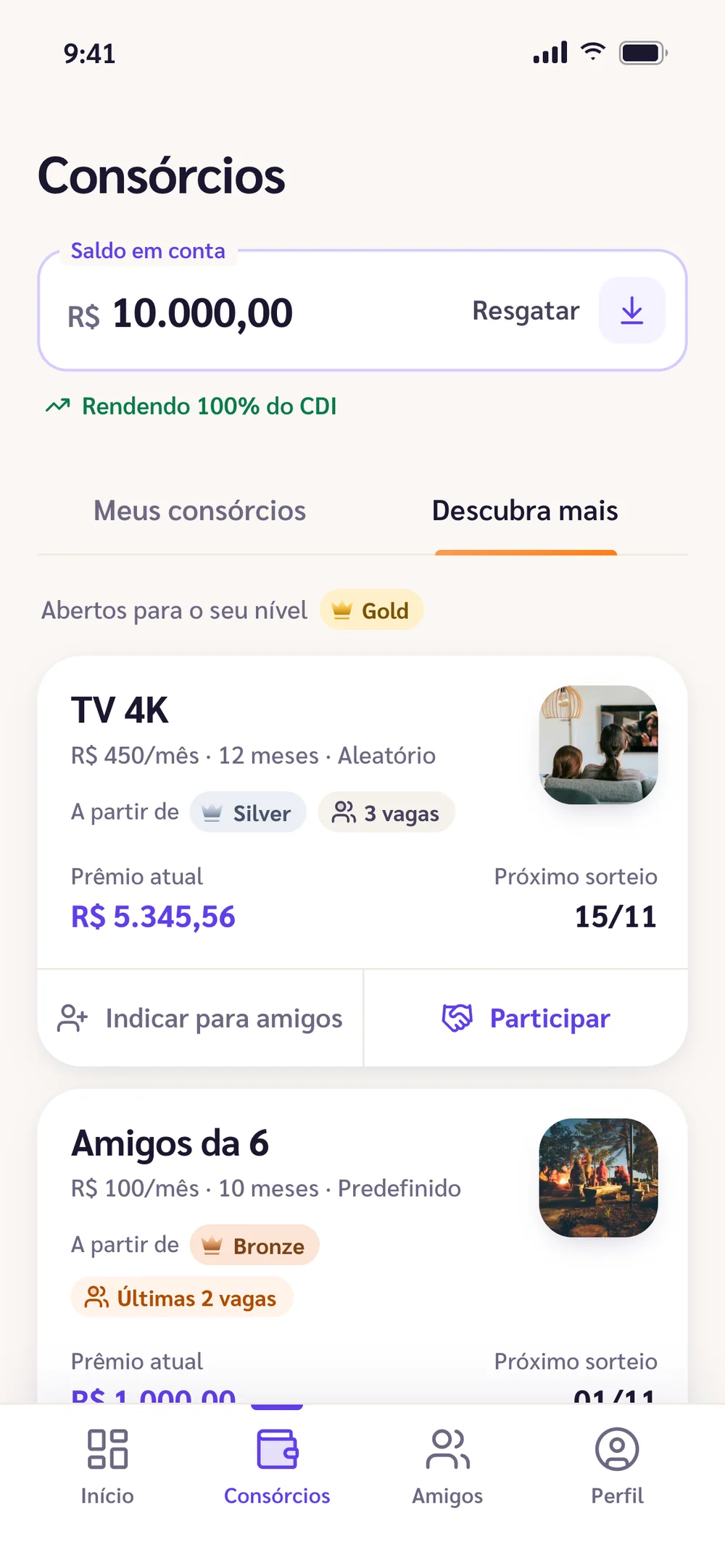
01 — My consórcios

Decision: Yours first

The home opens with what’s yours: the consórcios you’re in sit at the top. What your friends did comes after, in a feed.

In the finish, each consórcio gets its own theme, and the winner of the month becomes a card with amount and date.

Wireframe
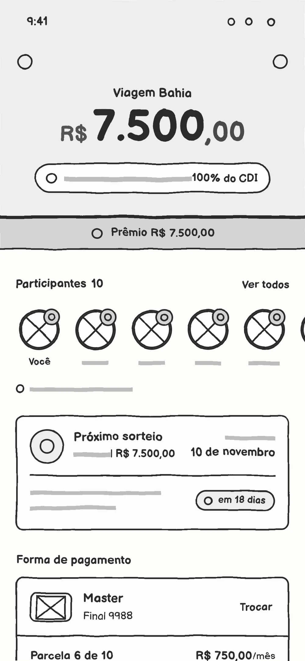
Consórcio details wireframe: header with the amount, prize bar, members as circles, next draw and payment method
Prototype

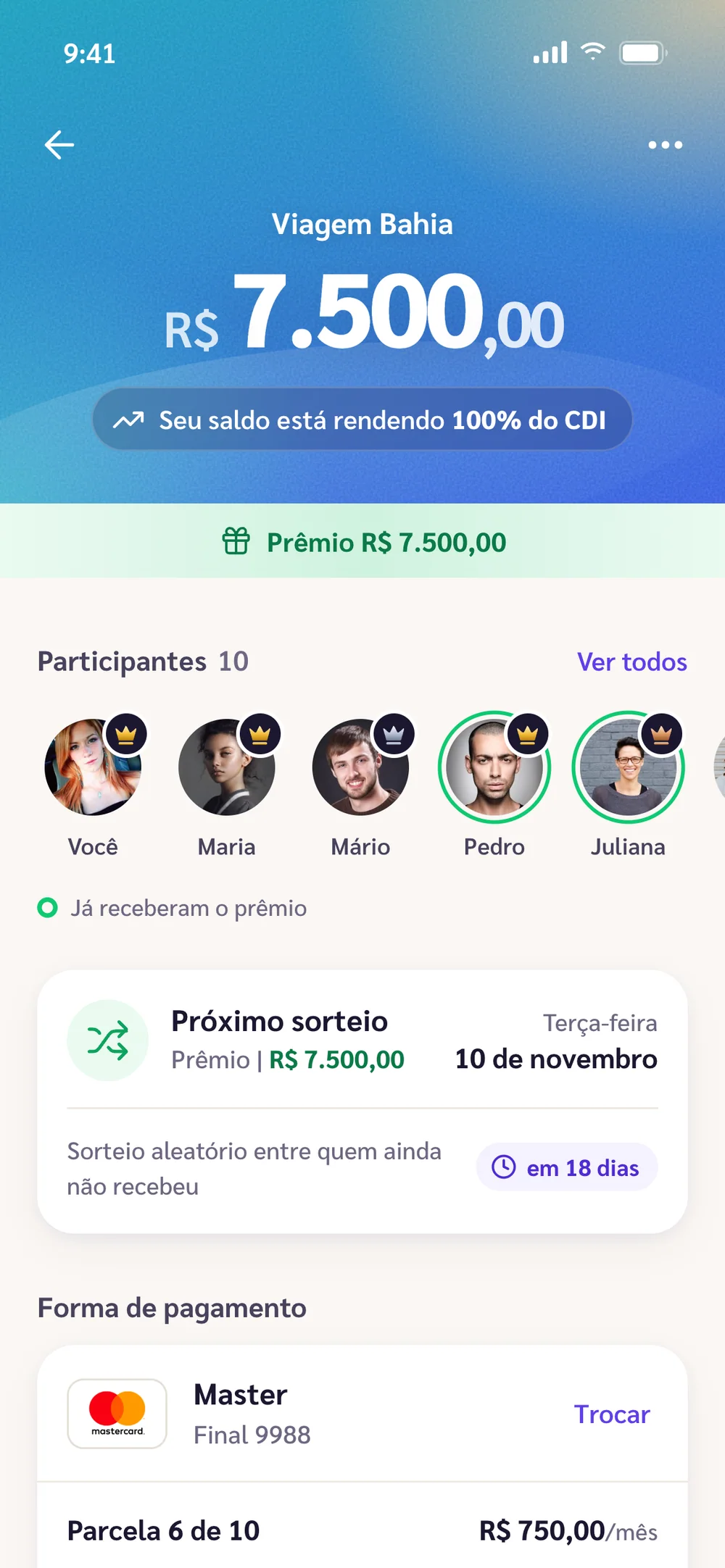
02 — The consórcio

Decision: Numbers that never disagree

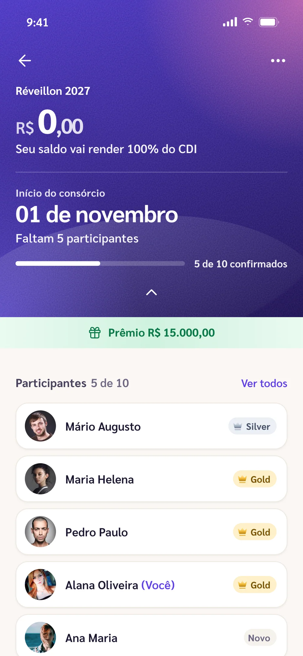
On the details screen, the first question is how much the group has saved. Right below come who’s in and when the next draw is.

Every amount comes from the same maths, so one screen never contradicts another. The next draw says how long is left.

Wireframe
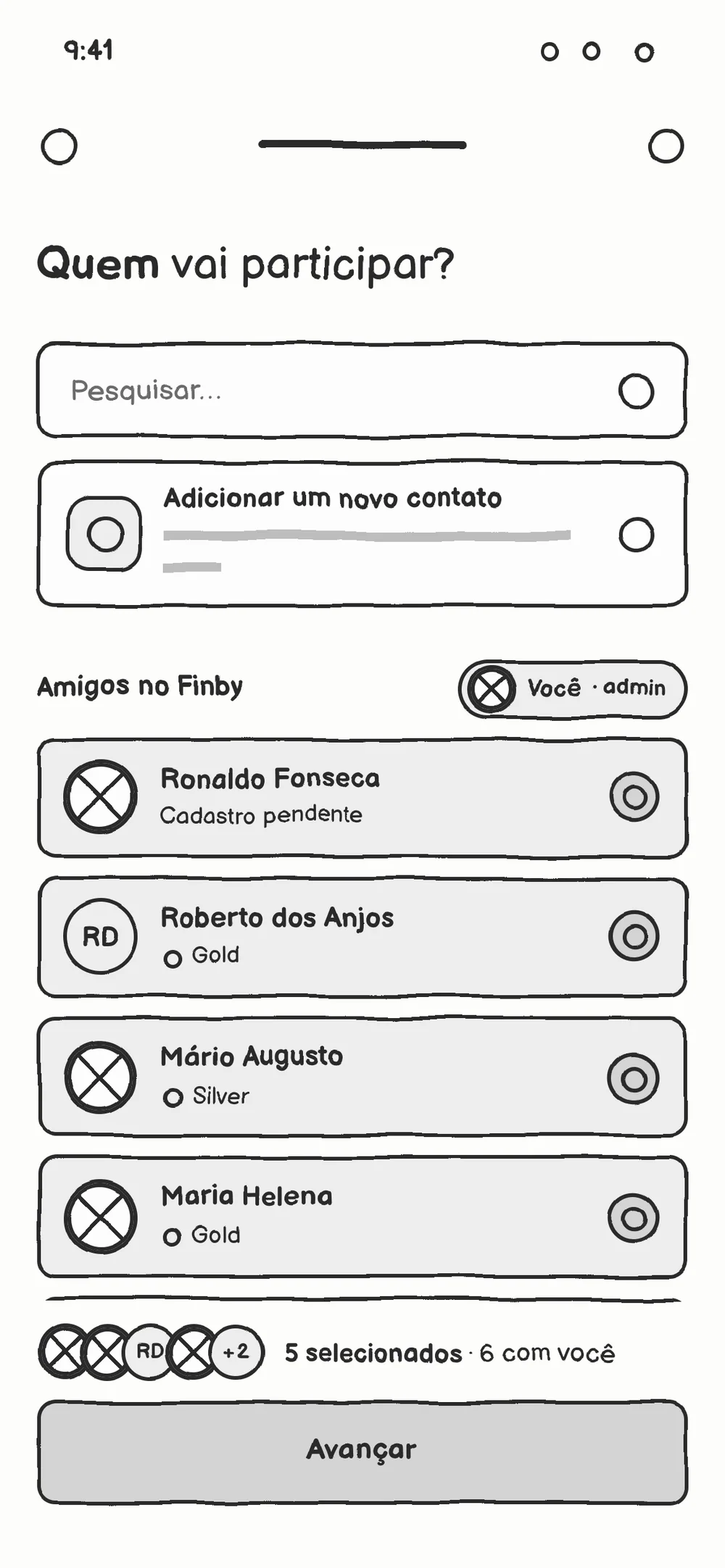
Who’s joining wireframe: search, add a new contact, a friends list with checkboxes and a footer with the selected count and Next
Prototype

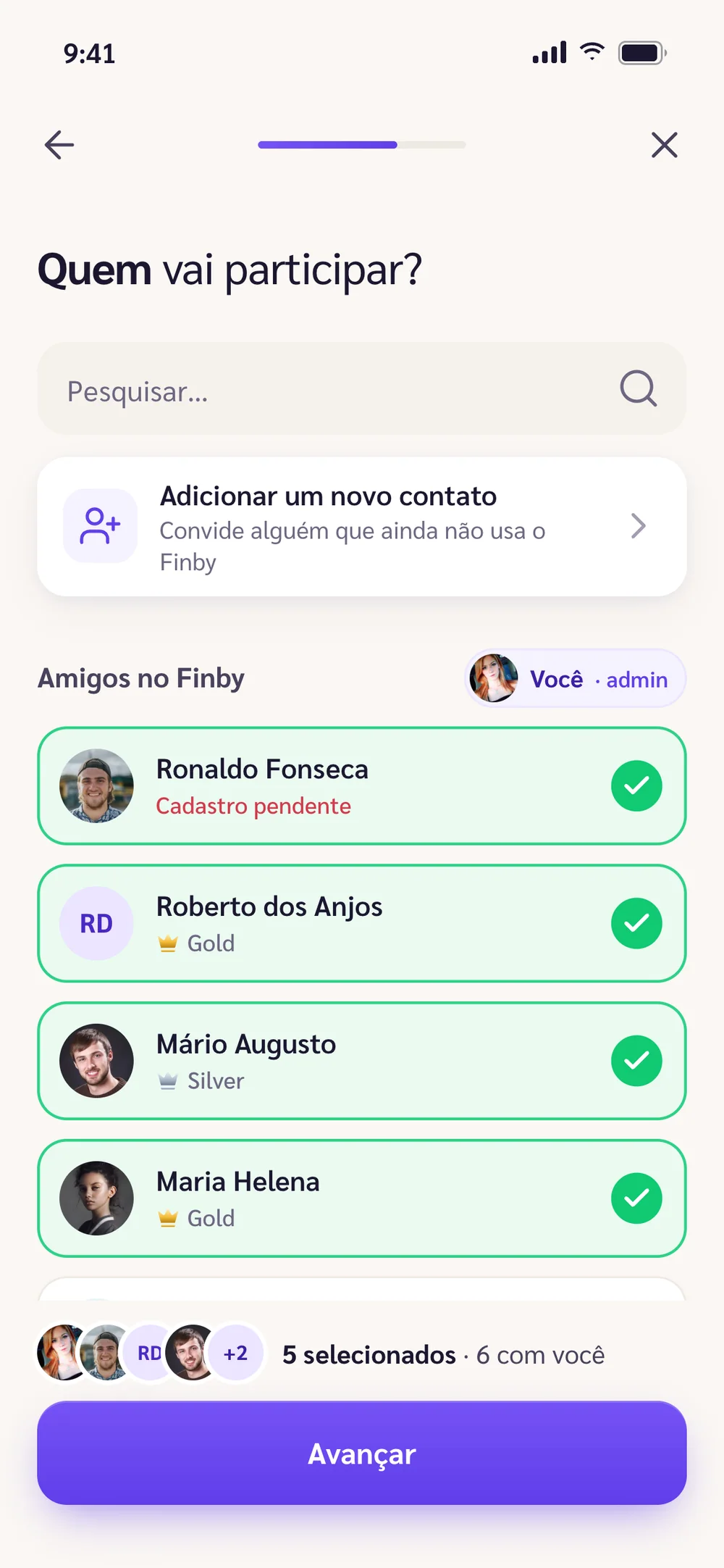
03 — Who’s joining

Decision: Nobody left out

Building the group means picking people, and not all of them are on the app. The list has search and a shortcut to invite whoever is missing.

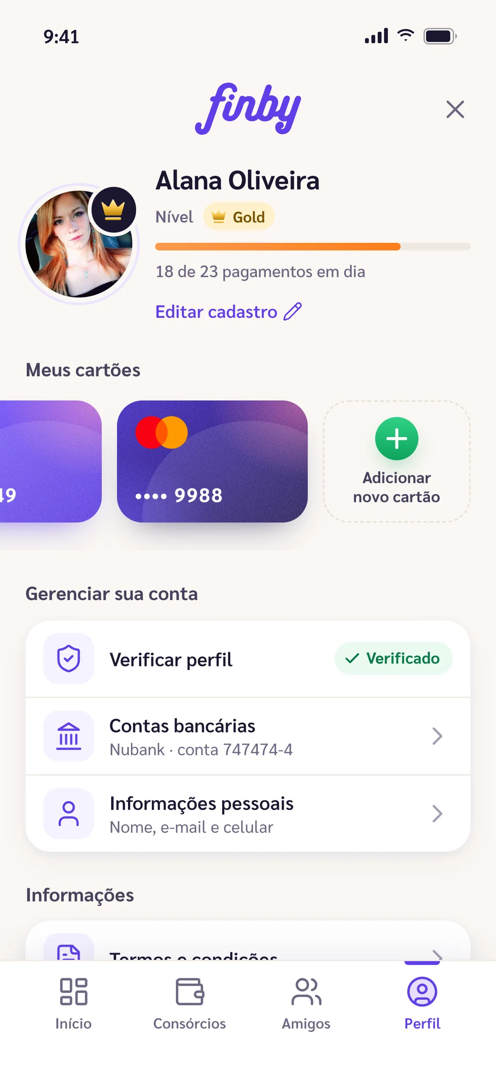
Selection shows in mint, with a check and AA-contrast text, and the count is announced to screen readers. People without an account join as pending.

Wireframe
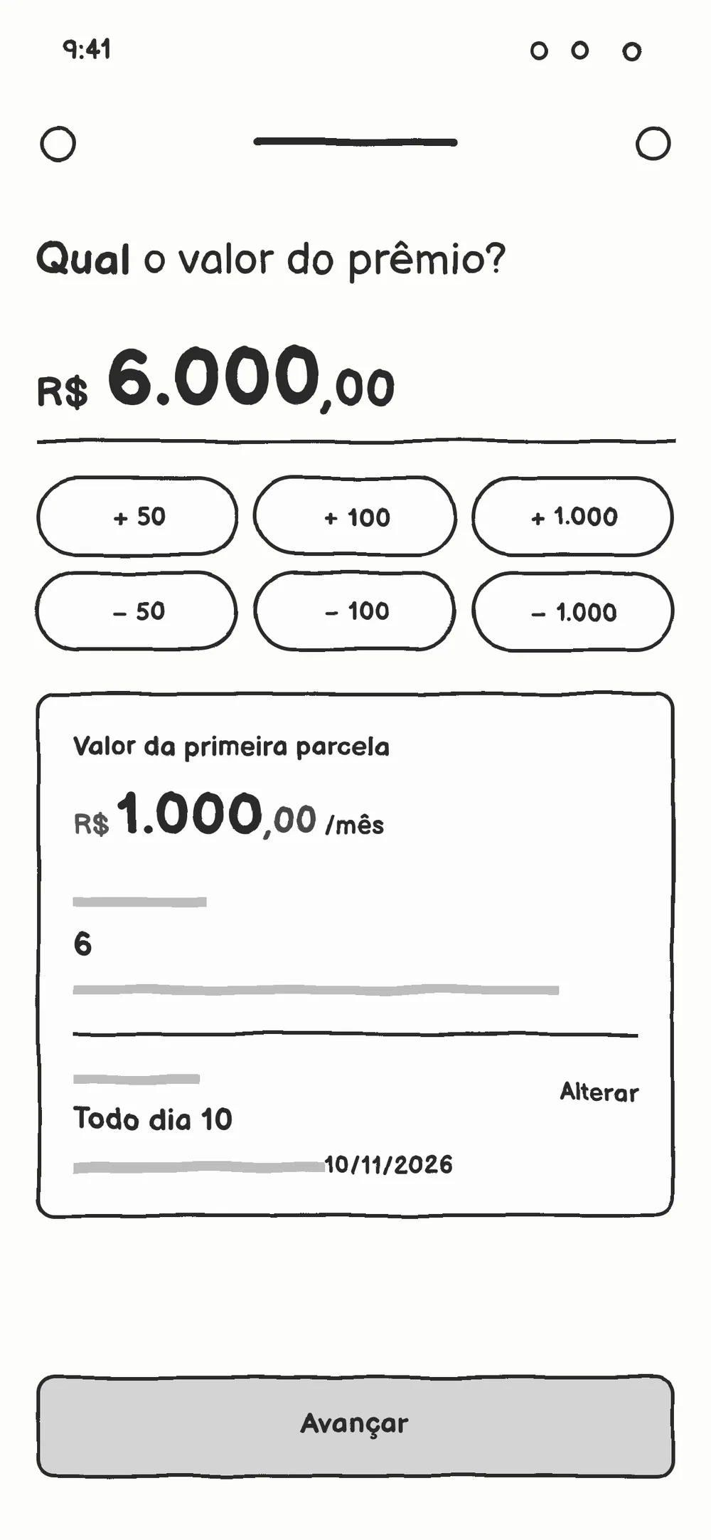
Prize amount wireframe: R$ 6,000.00 in large type, six plus and minus buttons and a block with instalment, members and due date
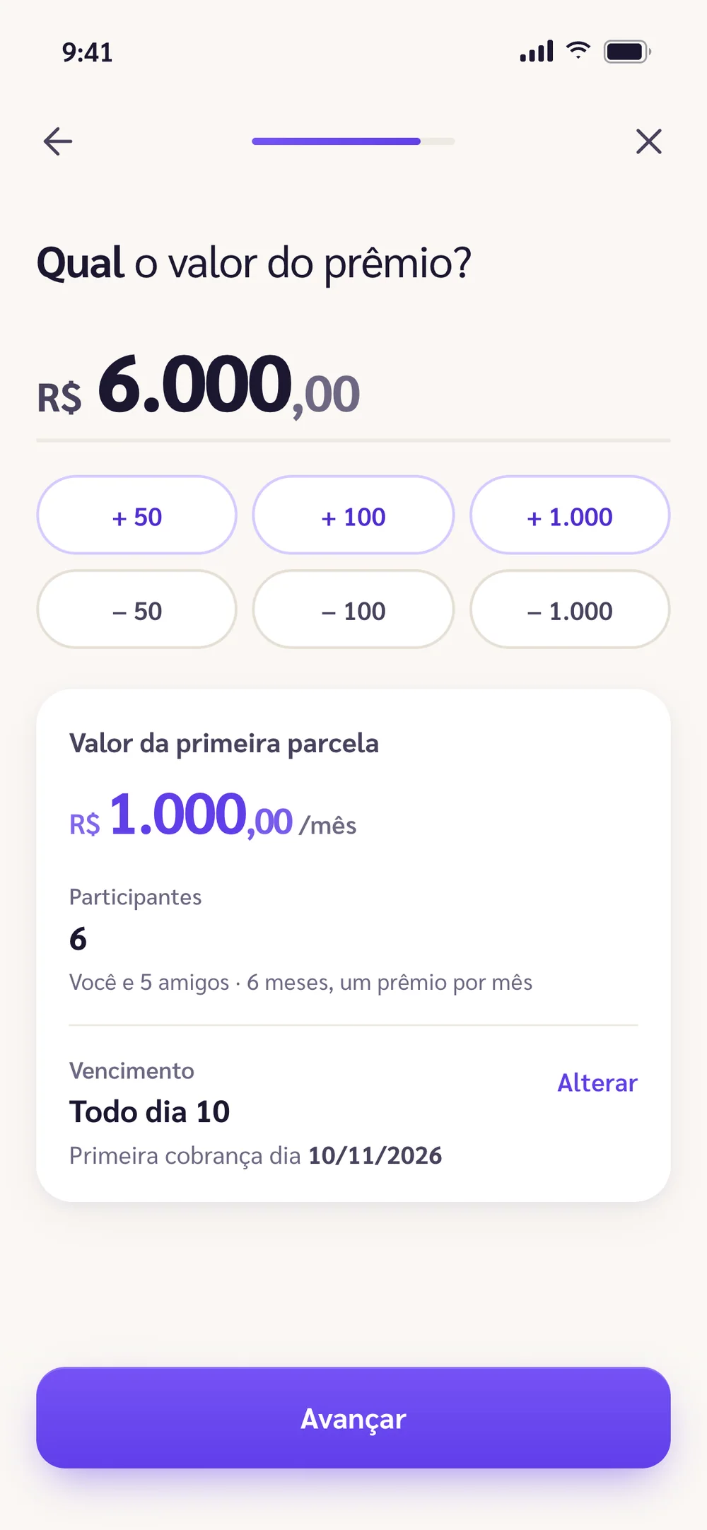
Prototype

04 — The prize amount

Decision: The maths in plain sight

Whoever creates a consórcio thinks about the prize first. So the amount dominates the screen, with the instalment right below.

The instalment is recalculated on every tap, with the maths written out: "You and 5 friends · 6 months, one prize a month". Buttons that would take the amount below zero are disabled.

Wireframe
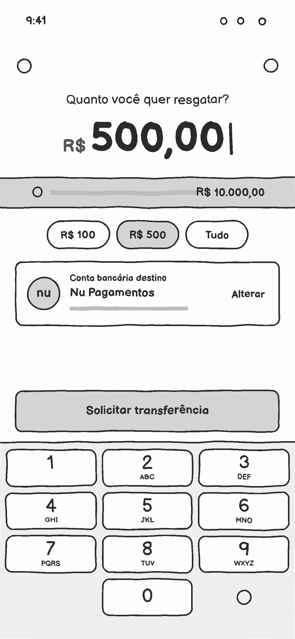
Withdrawal wireframe: R$ 500.00, balance bar, amount shortcuts, destination account, Request transfer button and keypad
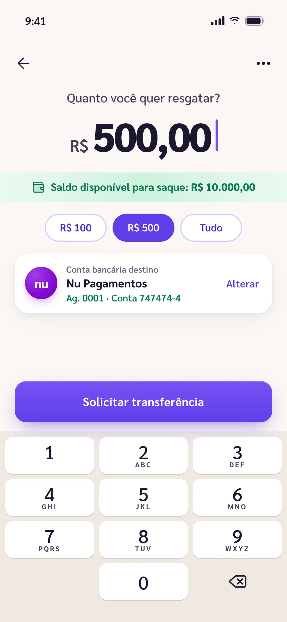
Prototype

05 — Withdrawing

Decision: Prevent the error

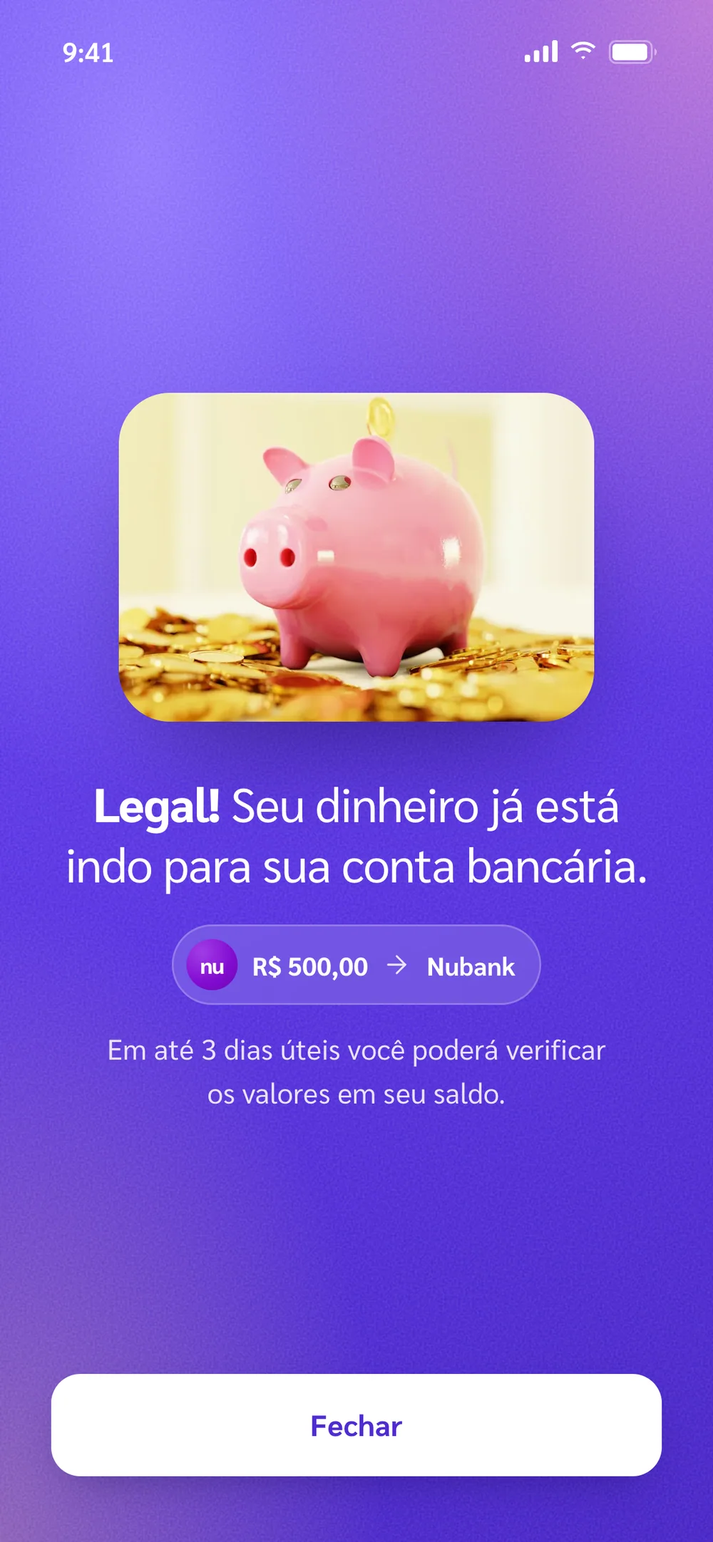
Withdrawing should feel like the banking app people already use. It fits on one screen, with a keypad that types from the cents up.

An amount above the balance disables the button with a message. The balance only changes after the review step.

04 — Decision: identity

The same brand, warmer

The design is mine, so the rule was to follow it. The brand violet and Sarabun stayed. I changed what made the app feel like a bank statement: cool greys became cream and emoji became photos of real people.

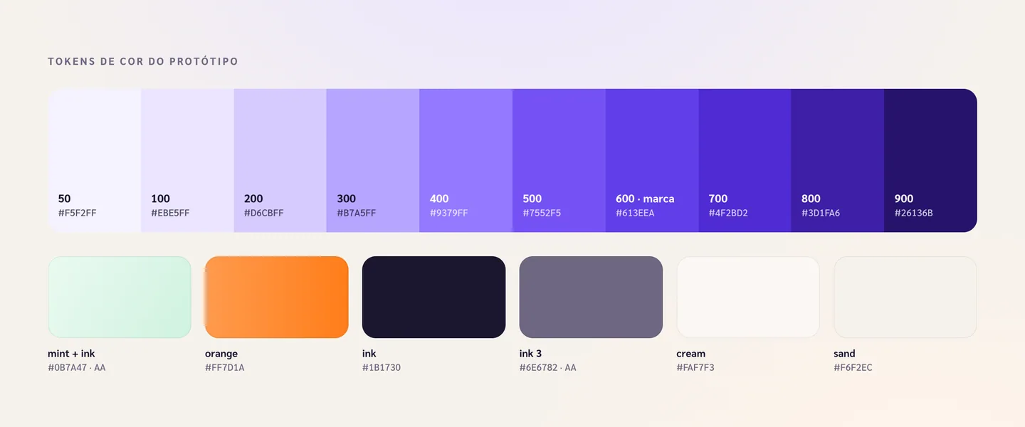
Prototype colour tokens: a ten-step violet scale with the brand at 600, plus mint, orange, ink and cream
A warmer palette

The brand violet became a ten-step scale and the cool background turned cream. The mint uses dark text to pass AA contrast.

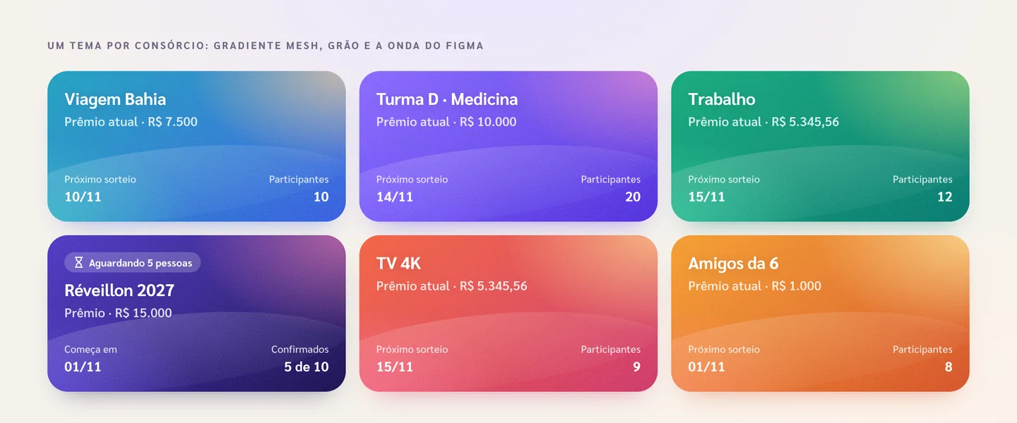
Six consórcio cards, one per theme: ocean, violet, mint, night, coral and amber, all with a grainy mesh gradient
One theme per consórcio

Six grainy gradients, one per theme. The creator picks it, and it follows the consórcio on its card and header.

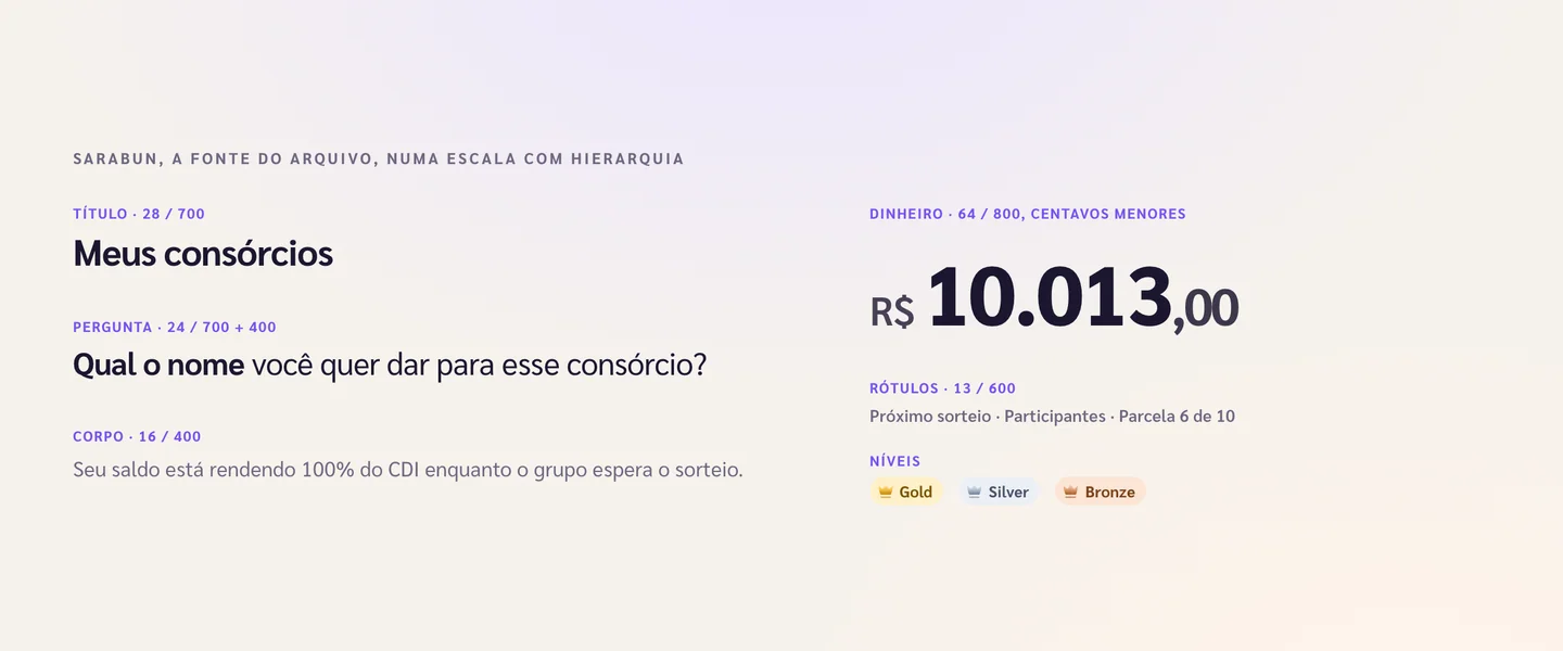
Sarabun type scale: title, two-weight question, body, labels, a money amount with smaller cents and level badges
Sarabun with hierarchy

The file’s typeface, with clearer hierarchy. In money amounts, "R$" and the cents are smaller so the value reads first.

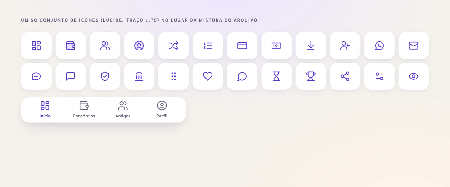
Twenty-four thin-stroke icons and the tab bar with Início, Consórcios, Amigos and Perfil
One icon set

A single stroke instead of the file’s mix of styles. The tab bar, which was icon-only, got labels.

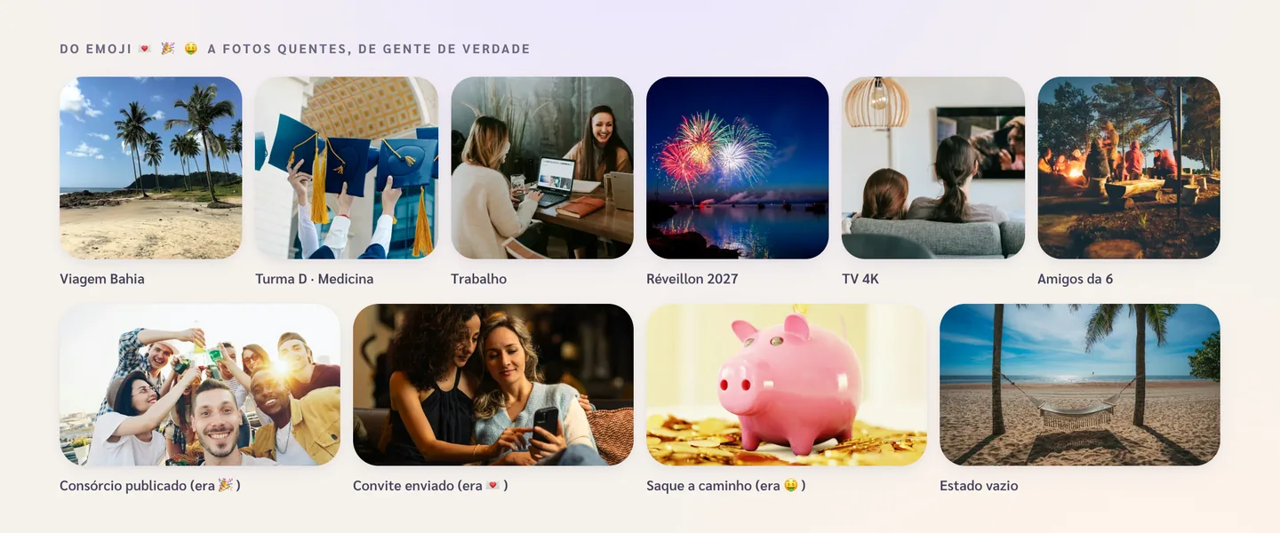
Ten photos: a beach with palm trees, graduation caps, coworkers laughing, New Year fireworks, friends watching TV, a campfire, friends toasting, friends looking at a phone, a piggy bank on coins and a hammock on the beach
Photos instead of emoji

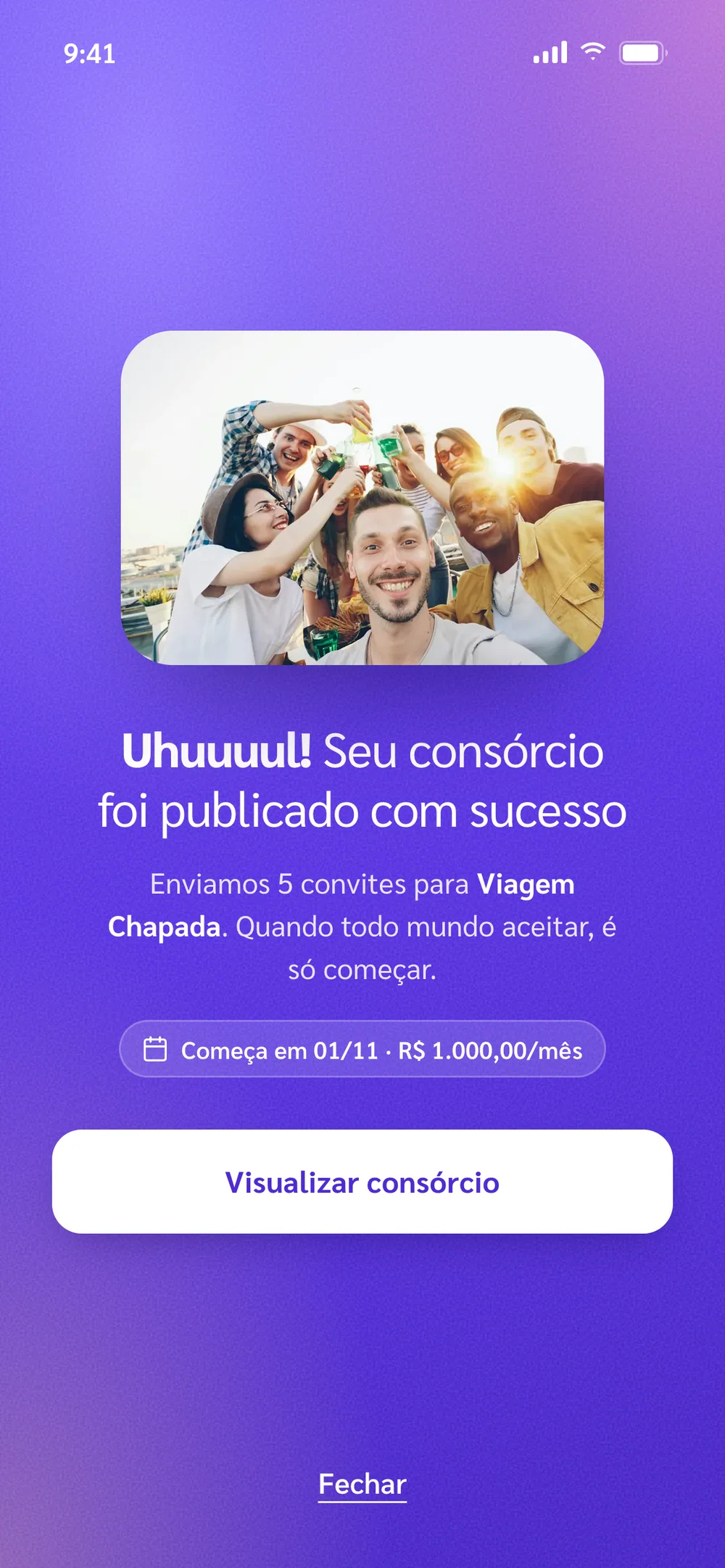
The emoji on the success screens became warm photos of real people, and each consórcio got a photo of its goal.

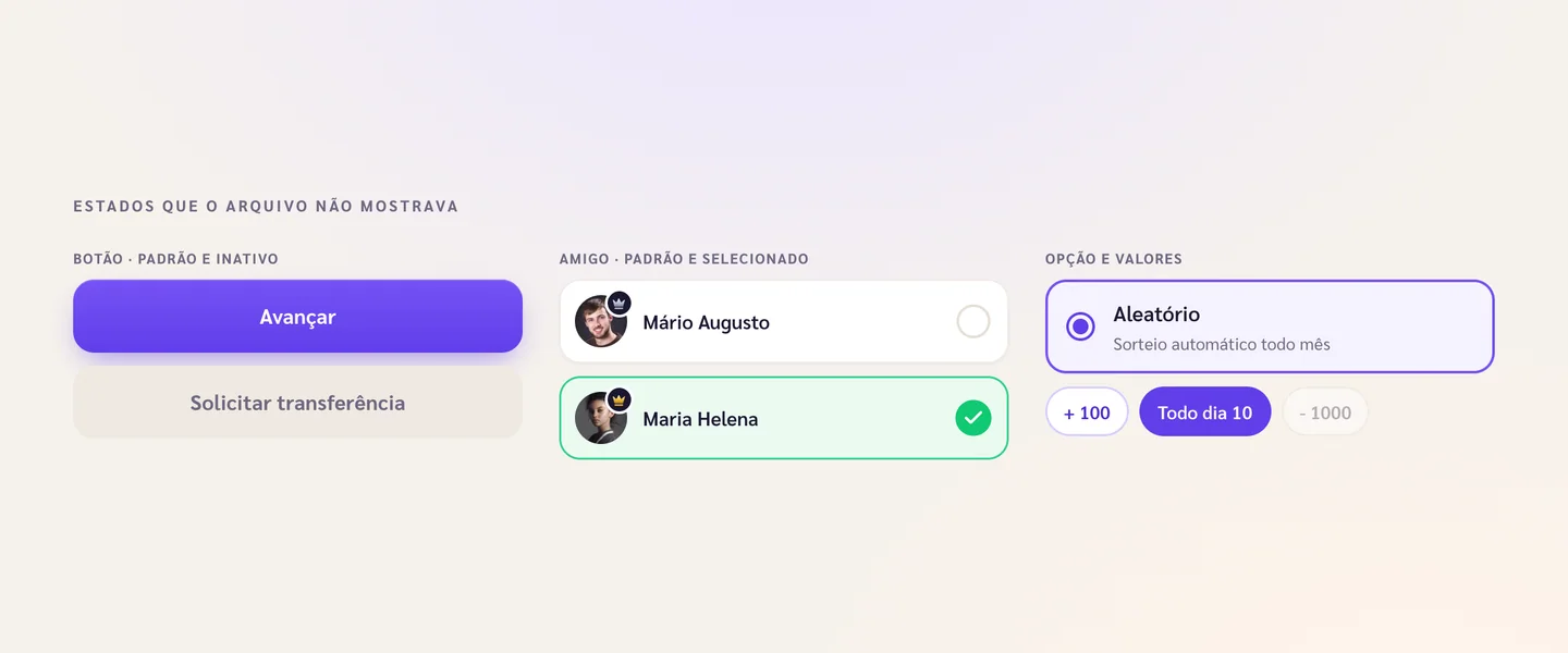
Component states: active and disabled button, default and selected friend, a checked radio option and chips
The missing states

The file showed each component in a single state. The prototype has default, selected, disabled and a visible focus.

05 — Decision: one flow

Two near-identical flows became one wizard

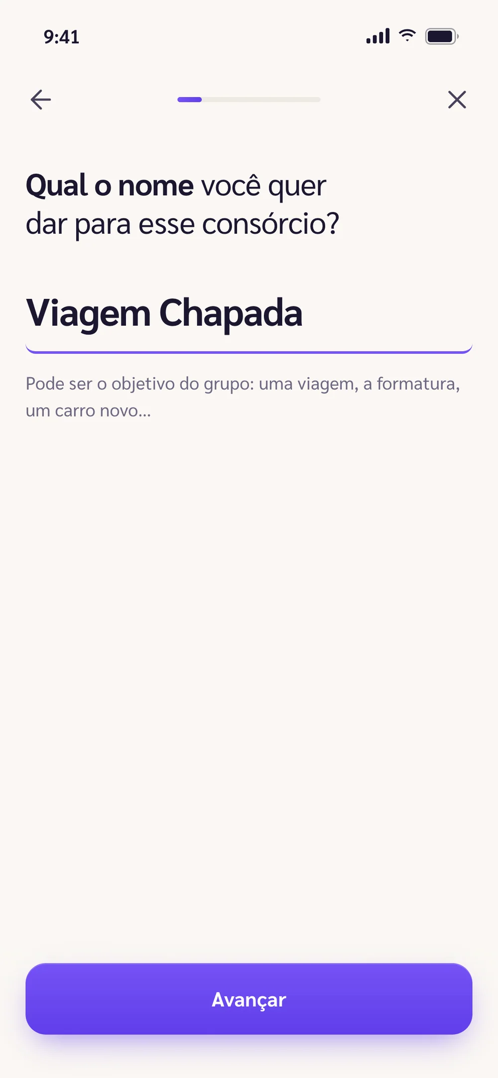
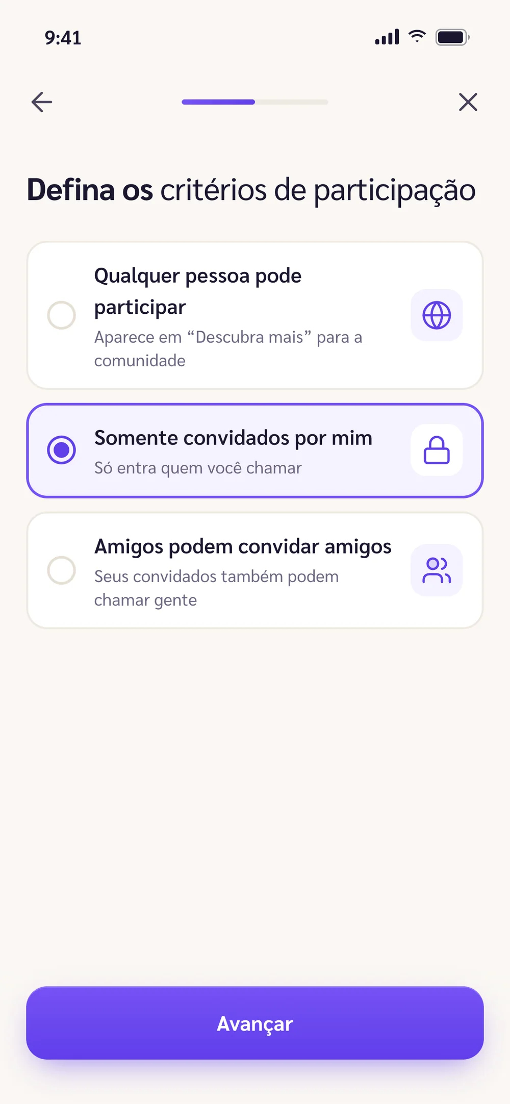
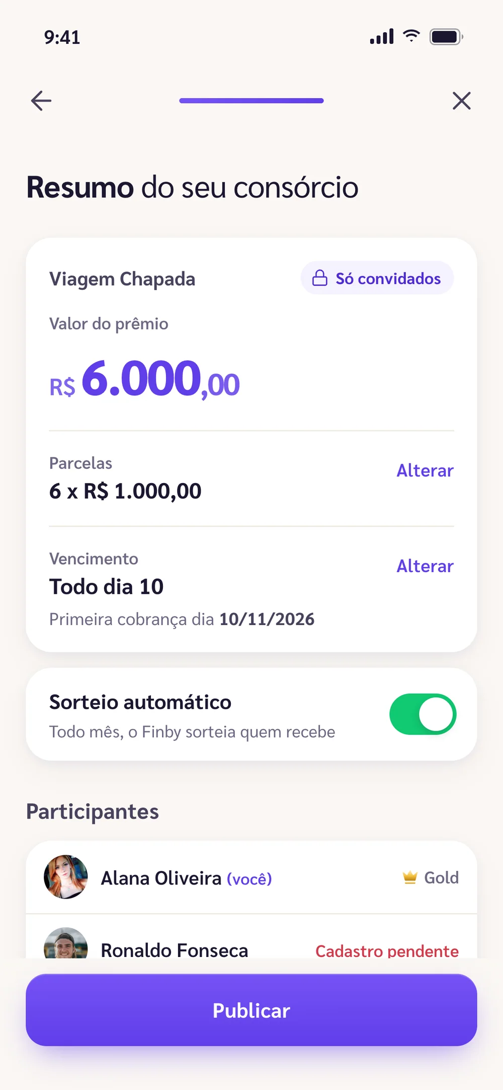
In the file, creating a private consórcio and creating a public one were two flows with nearly the same screens. I merged them into one wizard, one question per screen, that only splits at the entry criteria. The summary shows everything before publishing and lets you fix it right there, without stepping back.

06 — Inviting and organising

People who aren’t on the app can join too

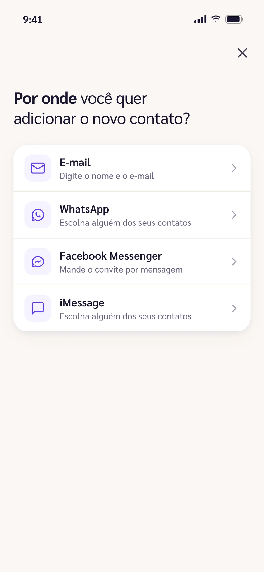
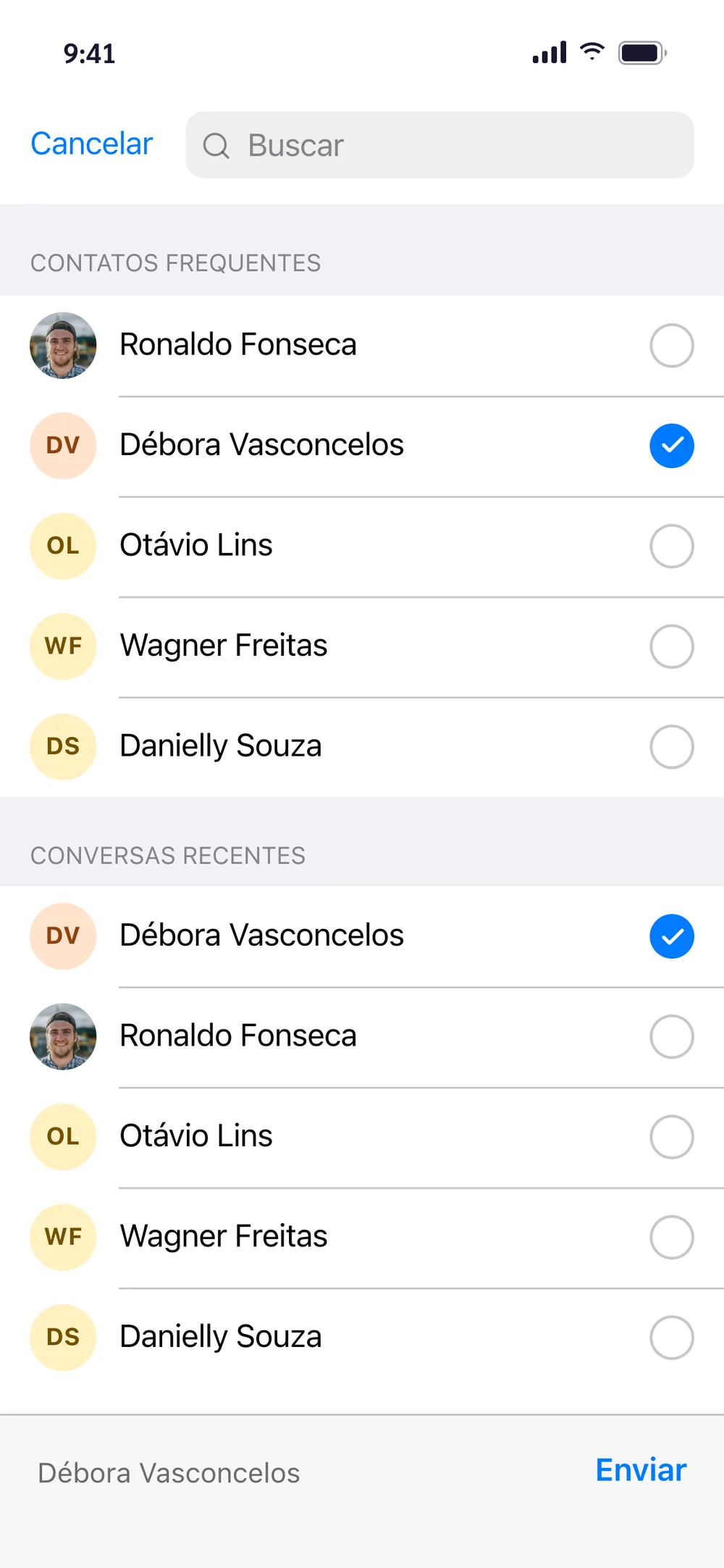
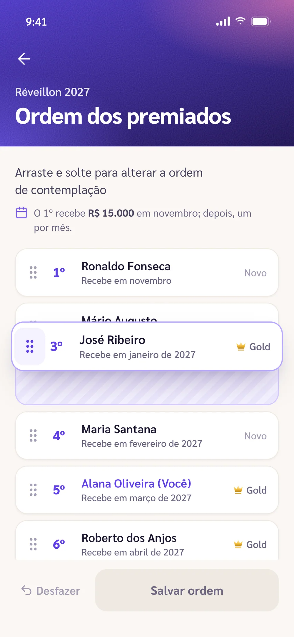
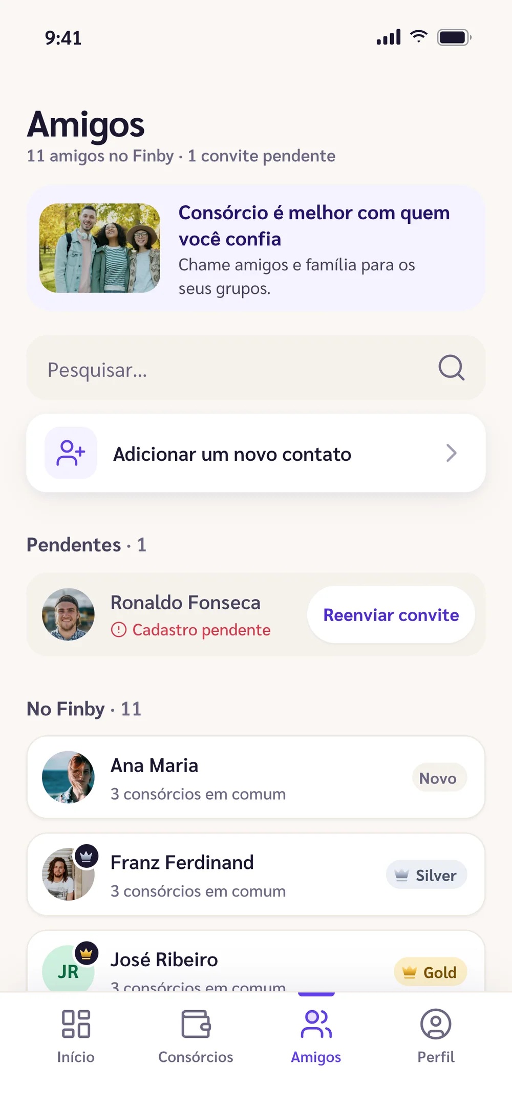
A consórcio among friends stalls if everyone has to download the app first. The invite goes out through the channel the person already uses, like WhatsApp, and they show up as a pending sign-up until they join. Admins drag members to set the payout order. The Friends tab had no designed screen, so I built it from the system’s components.

07 — Decision: trust

Among strangers, paying on time opens the door

Among friends, trust is already there. In a public consórcio, it has to come from somewhere. People who pay on time level up, and whoever creates a public consórcio can require a minimum level to join.

The profile shows that history. Admins see how many people are still missing, and the balance reaches your bank account in three taps.

08 — How I worked

80 screens in a file, a navigable app in days

I wrote the brief and the visual system, and had AI agents build the screens in parallel. Then I reviewed each one against my design: copy, states, contrast and the numbers, which have to match from screen to screen.

AI sped up production. The product and design decisions stayed with me, and that’s how I take an app from Figma to a testable prototype in days, not months.

Outcome

What the design gained

  • +A prototype you can use: 12 navigable screens, from invite to withdrawal
  • +My design kept intact, with a warmer brand and AA contrast
  • +Numbers that agree across screens: prize, instalment, balance and winners
  • +Both creation flows in one wizard, with an editable summary
  • +The states and the Friends screen the file was missing

Tools

FigmaHTML, CSS and JavaScriptAI agentsPlaywrightFree photos from Unsplash

Got an app in Figma that deserves to leave the file?

I take it from design to a prototype you can use, in days, and handle what the file doesn’t show, from states to numbers that add up.