Rescuing a care app everyone had given up on: less scope, a family-first focus and, in one week, workshop, redesign and 100% of the front end ready for beta — approved on the first try.
Client
Altevita · Care clinic
Year
2026
Role
Product Designer & Design Engineer — solo
Platform
Mobile app · iOS & Android
Context
Rescue of a project stuck for 2 years before I came in
CuidaMe is an Altevita app for following someone’s care. It began as a care-company tool, built around team management, shift scheduling and caregiver visits.
By the time I came in, the product had spent two years in a loop: build it, it is not what they expected, build it again. The client relationship was worn down and the project was, in practice, headed for cancellation. I was brought in to unblock it.
What I did
Project rescueMapping workshopScope redefinitionUX research & flowsUI redesignNavigable prototypeValidation cyclesDesign systemFront-end (straight to production)Stakeholder meetings
2 yearsstuck before I came in, unblocked
1 weekworkshop, redesign and 100% of the front end
100%of the front end ready for beta testers in 7 days
1stprototype version, approved on the first try
0handoff — from design straight to production
Newproduct the client will now commercialize
01 — The screens
Screens a family understands the first time
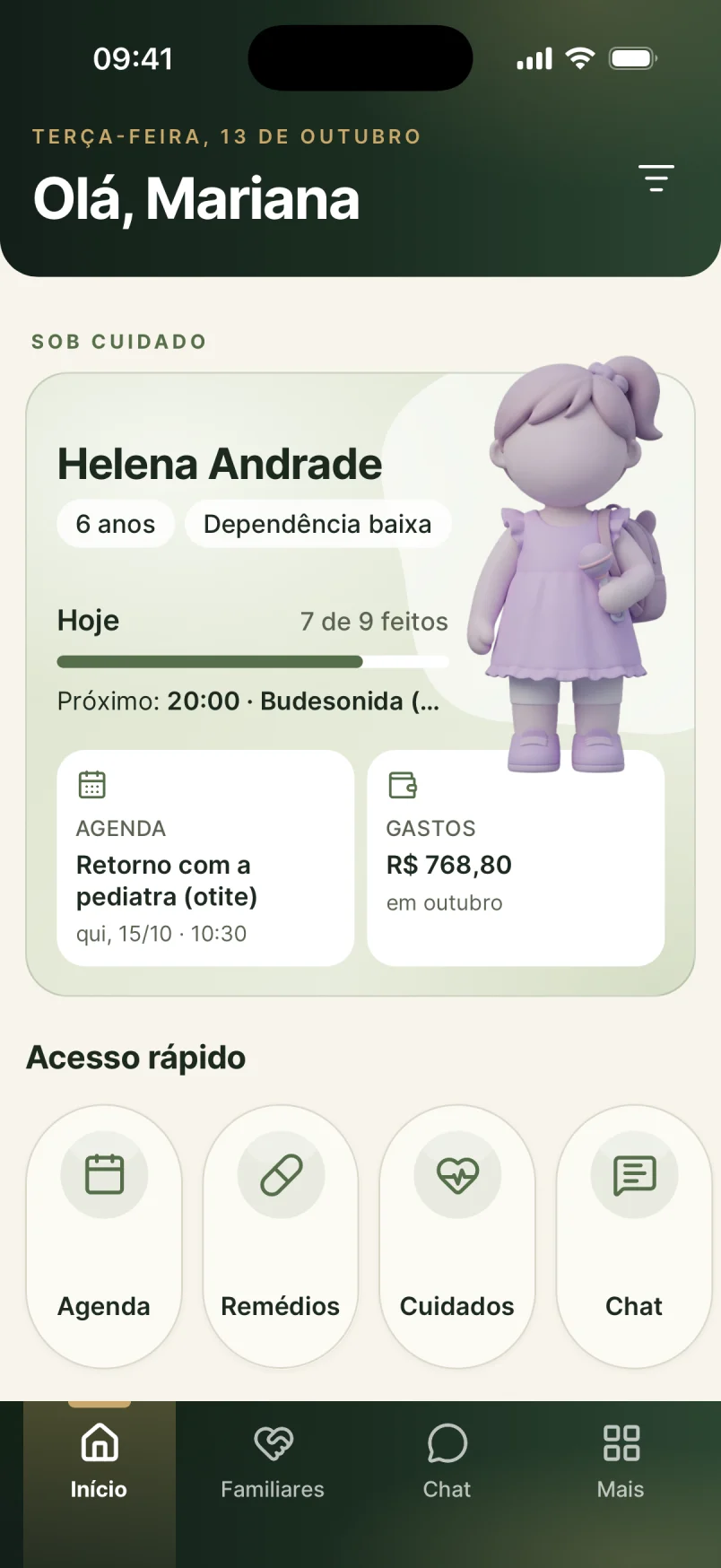
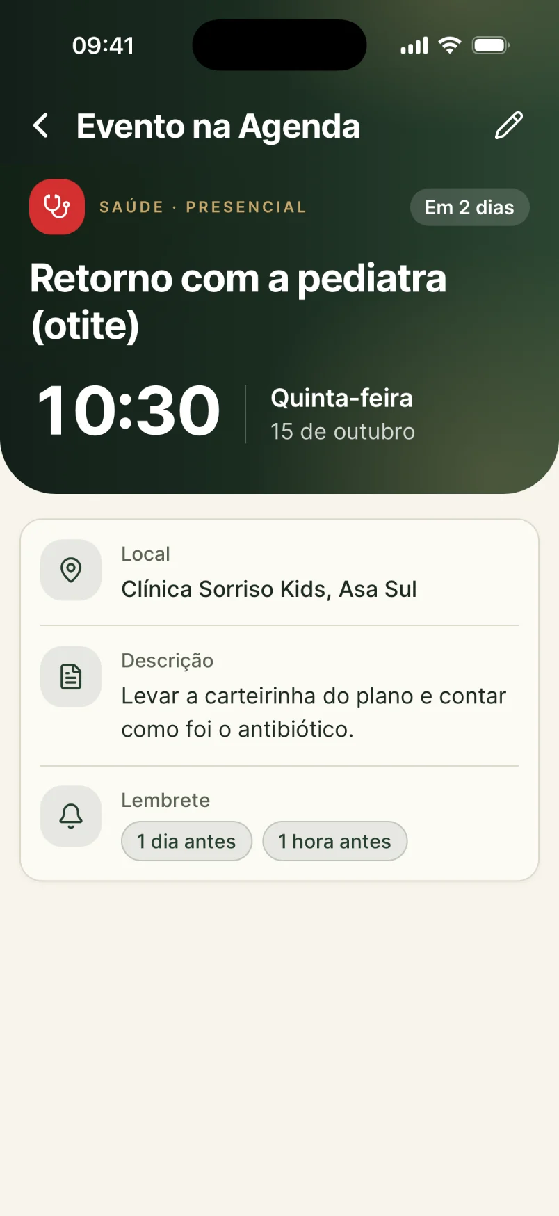
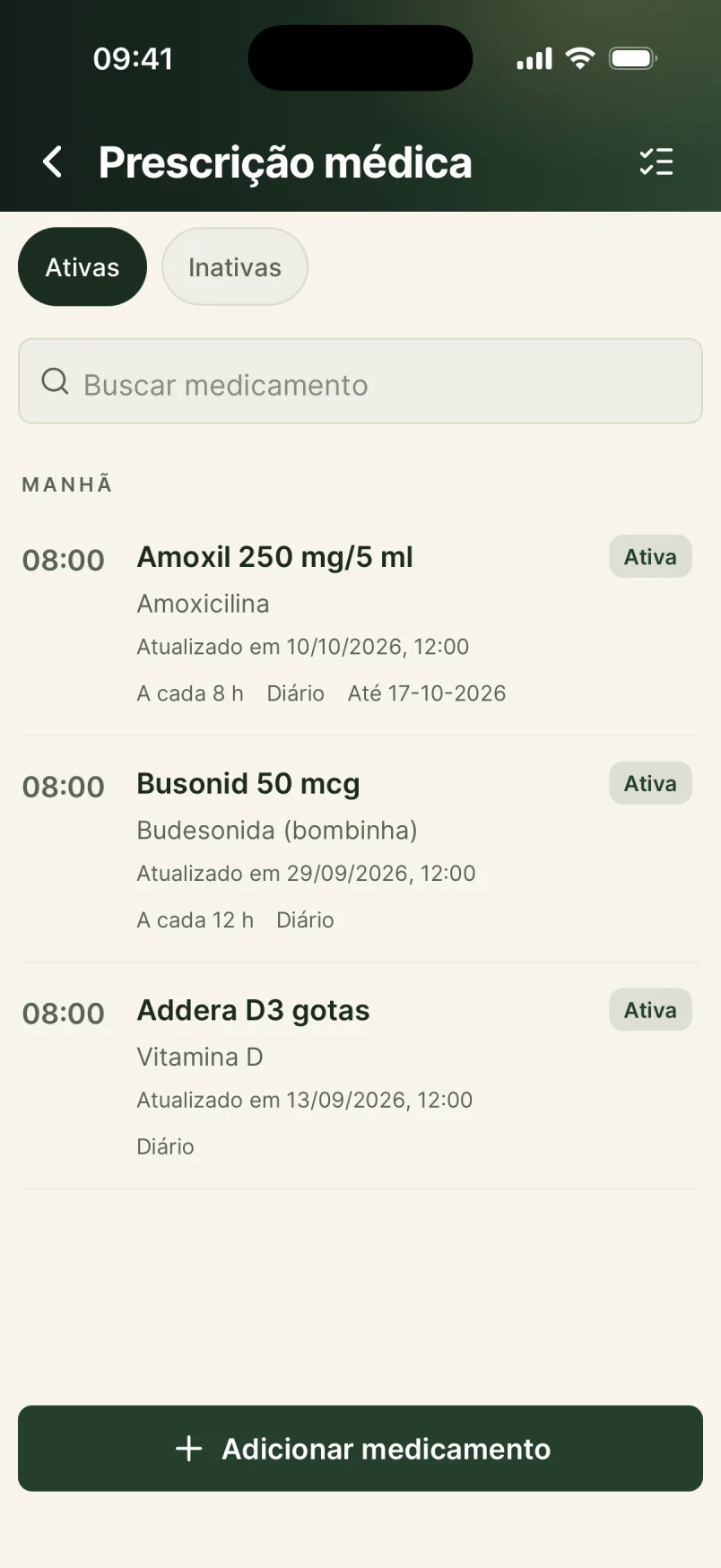
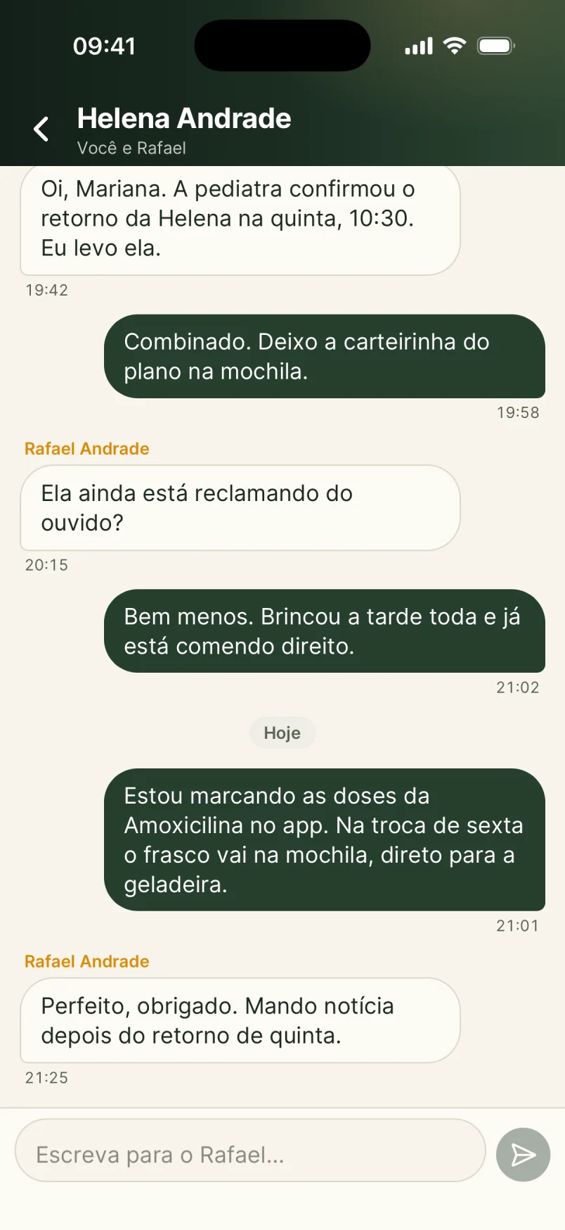
I redesigned the whole interface for the new audience: plain language, clear hierarchy, and the everyday actions one tap away. One record, seen by everyone who cares.
02 — The problem
Two years of back-and-forth and a relationship to reset
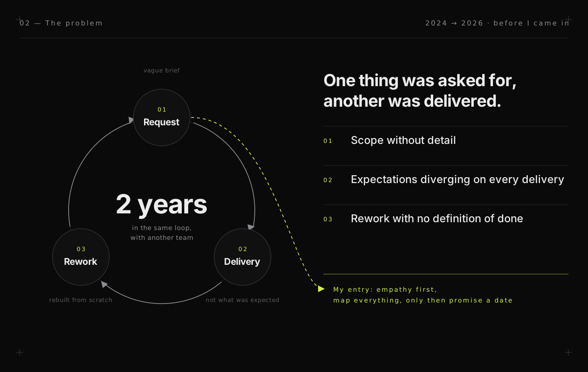
Before I came in, the project had spent two years with another team and derailed for the most common reason: a lack of detail. One thing was asked for, another was delivered, and it was redone. Two years in, the client was frustrated with good reason and the product had stalled.
My job was not to draw pretty screens on top of a fuzzy scope. It was to be the piece that unblocks: give back clarity before giving back code.
The relationship was worn down, and that came before any screen. I ran an empathy process with the client: listening to where it hurt, understanding what they expected and what they had already given up asking for. The goal was not to deliver what was agreed — it was to deliver far beyond expectations, so trust came back together with the product.
The root of the derailment: scope without detail turns into endless rework.
Before — the app I inherited
Before
Before
Before
Before
Before
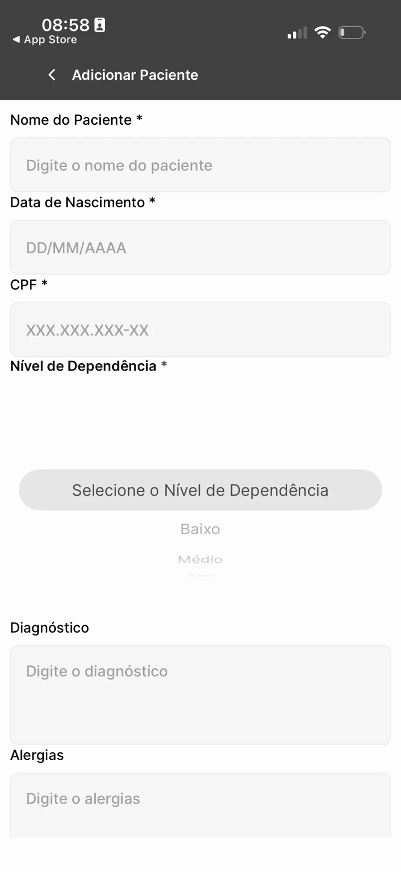
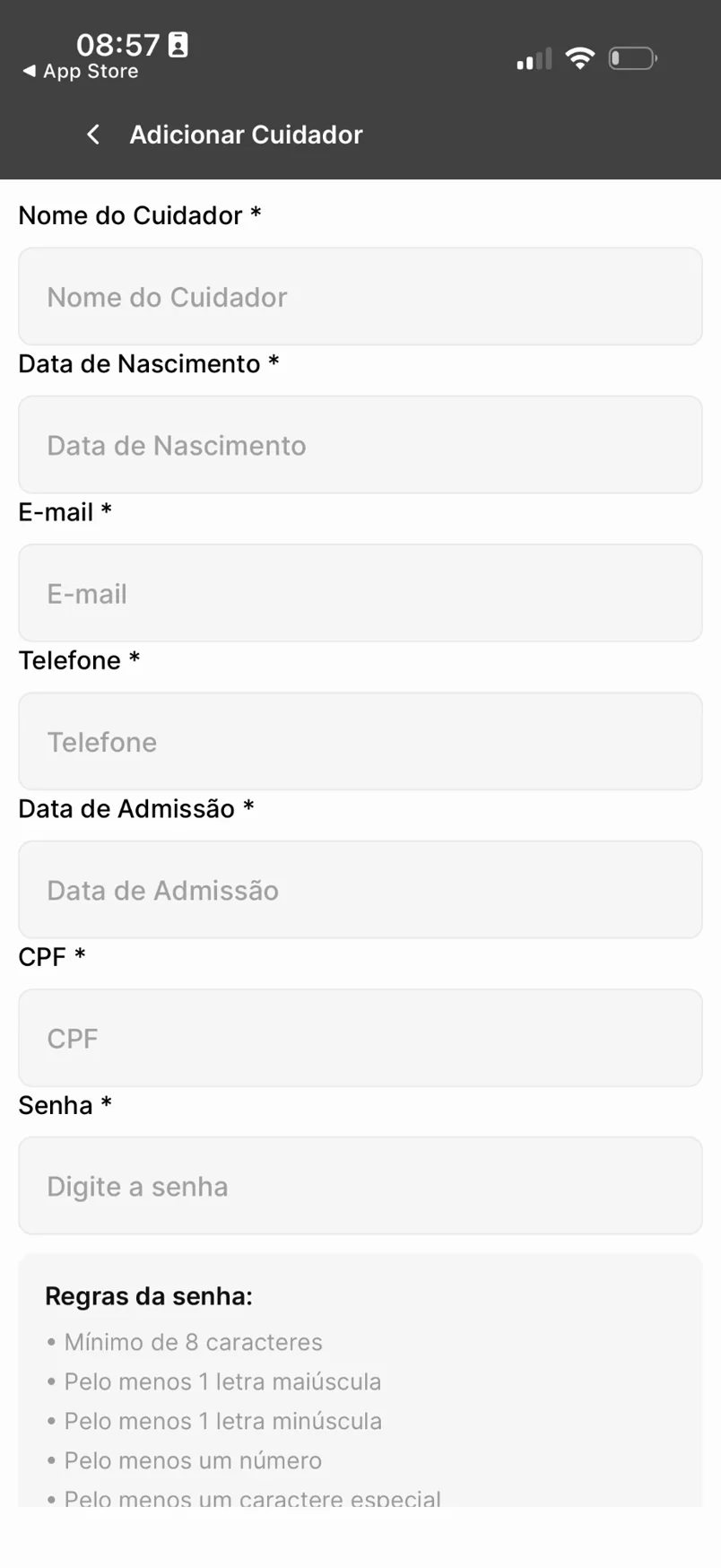
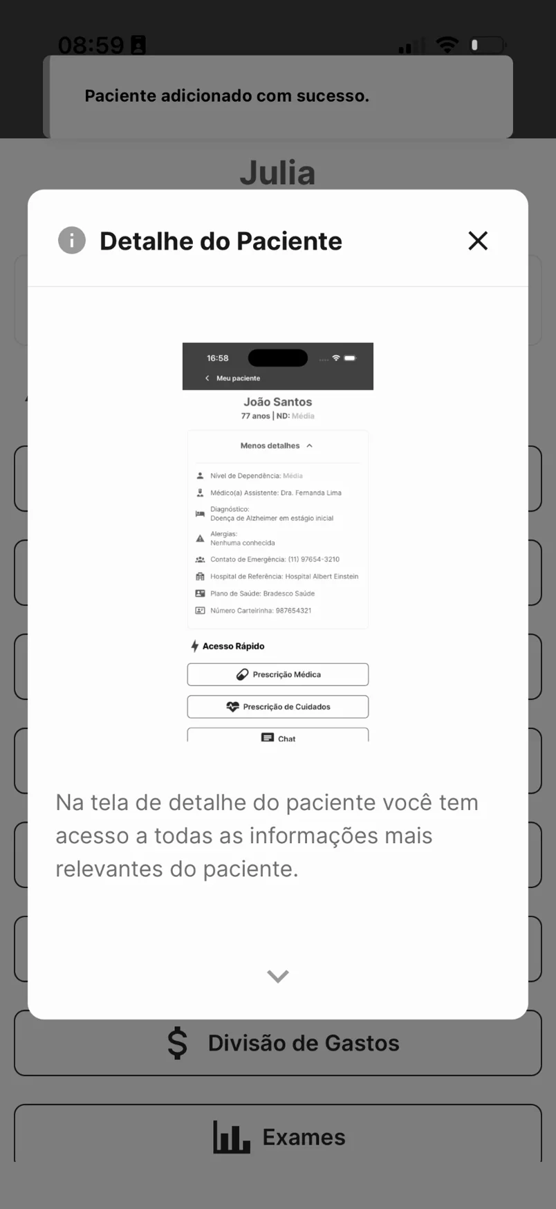
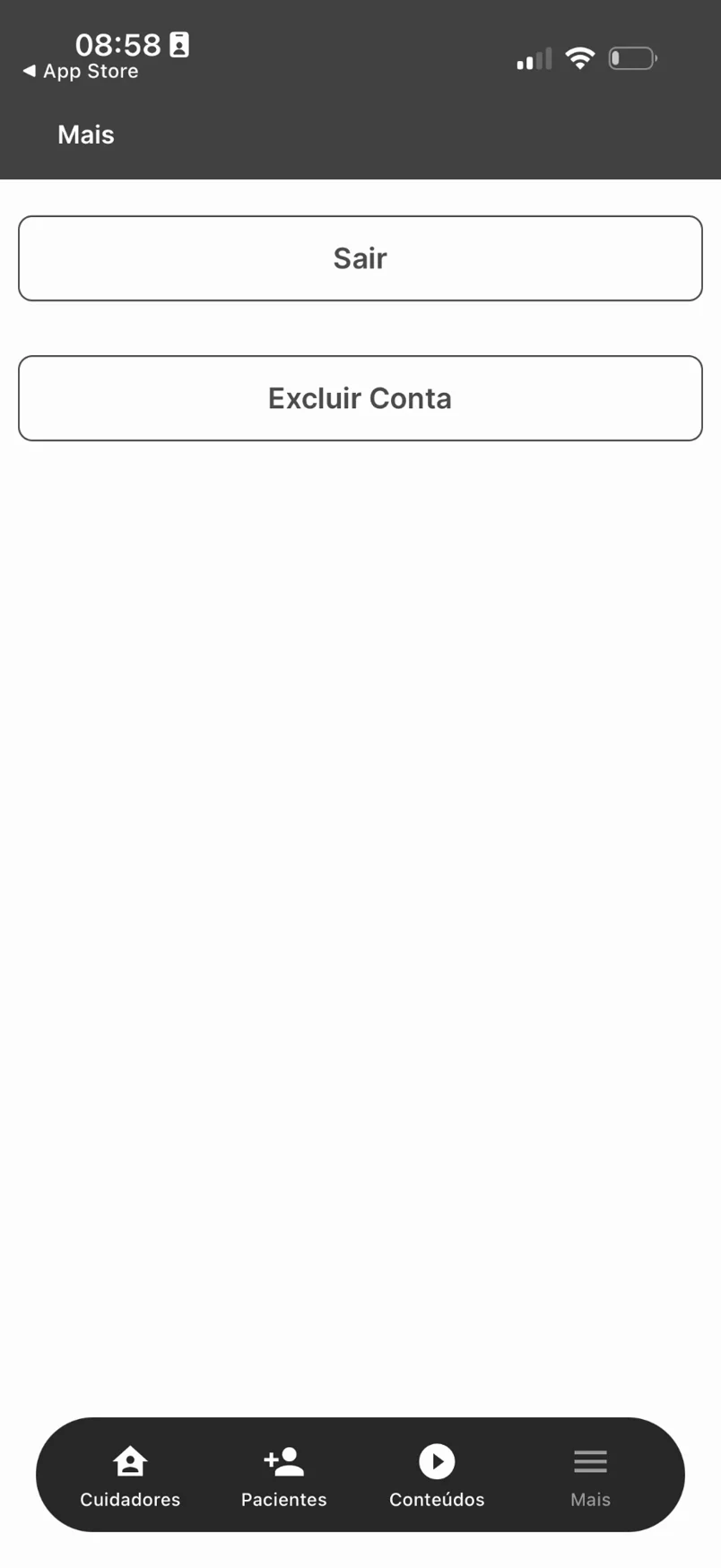
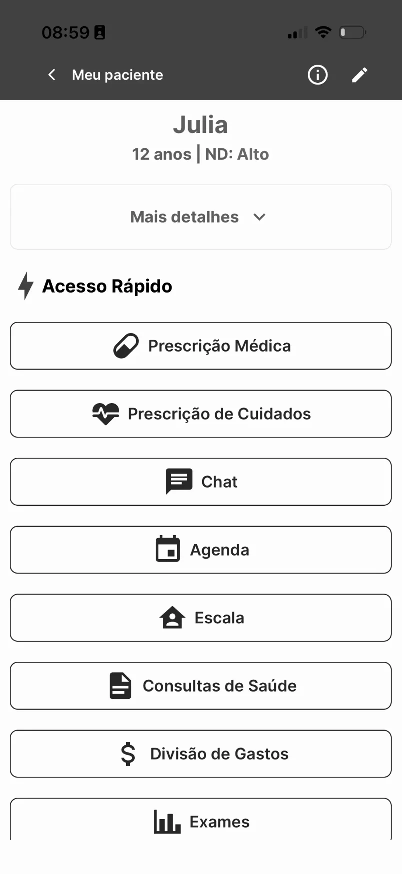
The app as published before I came in, two years of rework later: fifteen-field forms, screens made of identical buttons, modals on top of modals and a “More” tab with nothing but Sign out and Delete account. This is what the client was using — and why she was frustrated.
03 — The method
Map every screen before promising any deadline
I flipped the order. Before talking about deadlines, I ran a mapping workshop with the client: screen by screen, flow by flow, journey by journey. No thirty-minute meeting.
Out of it came a navigable prototype the client could actually use. They critiqued, I adjusted, in cycles, until it was 100%. Only then did we commit to a timeline — with the scope clear to both sides, not in the dark.
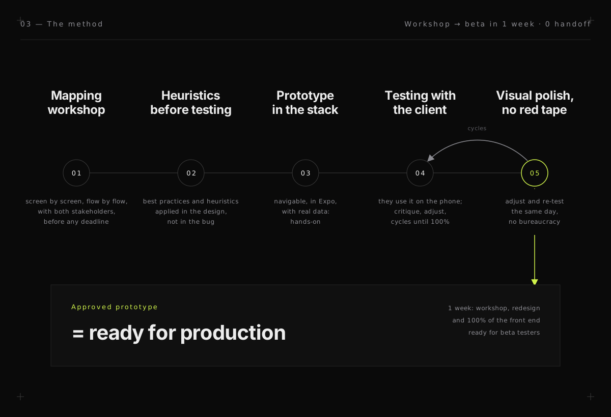
The prototype was born in the final stack, in Expo. Before each round with the client I ran the screens through usability heuristics and UI best practices; testing was saved for what only real use reveals. Visual polish happened straight in the code, the same day, with no document in between. When the client approved, the prototype was the product.
From workshop to approved prototype: heuristics before testing, testing with the client, polish straight in the stack. The approved prototype is production.
04 — The product pivot
Less app, not more app
The direction changed: it was not a new app, it was the current one, simplified. In the client’s words, the goal was not to add anything — it was to remove. The audience changed too, from a company tool to family use, at home.
CuidaMe became a shared family care record. Two scenarios guided everything: siblings sharing the care of aging parents, and separated parents sharing the care of their children.
Out went the company features: management, shift scheduling, caregiver visits, vital-sign checks and progress logs. What stayed was the family essentials: an appointments calendar, medication and care prescriptions, a family chat, nursing notes only for incidents, and a channel to send announcements and videos.
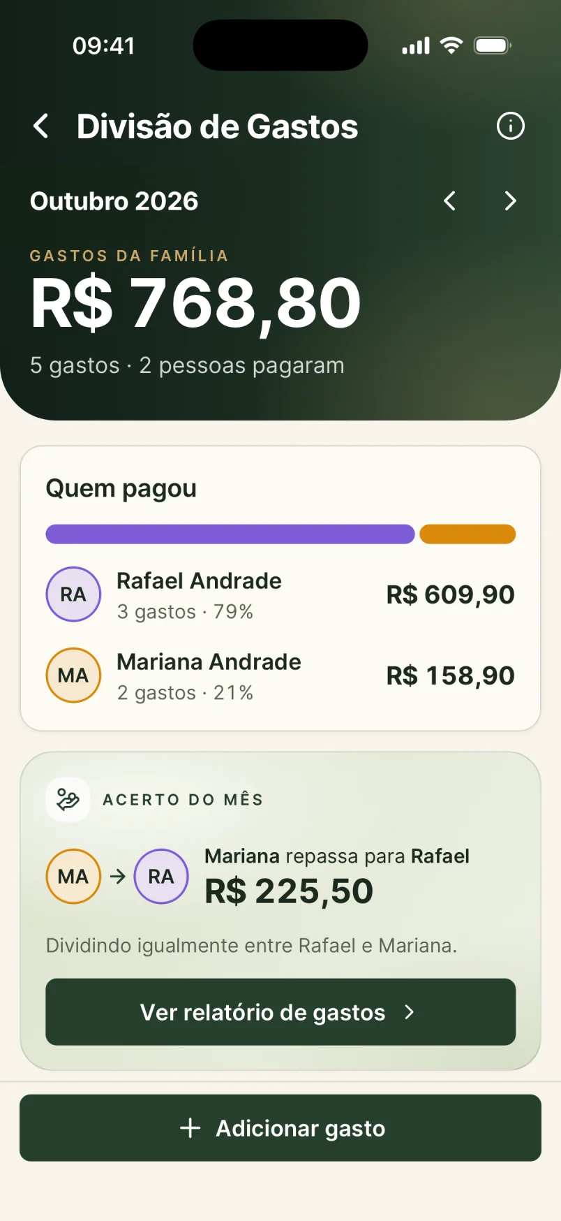
And one new piece came in: expense splitting in the style of Tricount. Each person logs what they spent on care and the app works out who owes whom — because sharing care also means sharing the bill.
Before
After
01 — Person profile
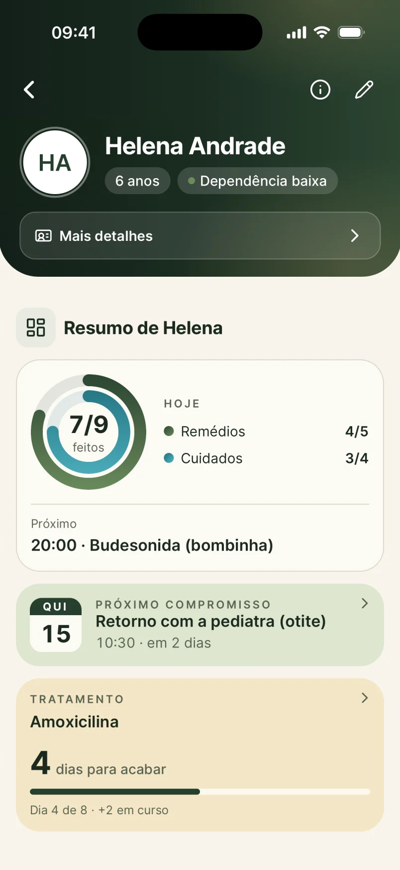
Heuristic: Aesthetic and minimalist design · recognition rather than recall
The person screen was a stack of eight identical buttons that said nothing about what matters today, topped by clinical jargon: “ND: Alto”.
The redesign opens with what the family needs right now: 7 of 9 done today, the next appointment and the ongoing treatment. Actions became quick access with icon and name, and “ND: Alto” became “Low dependency”, in plain home language.
Before
After
02 — Sign-up and record
Heuristic: Error prevention · flexibility and efficiency of use
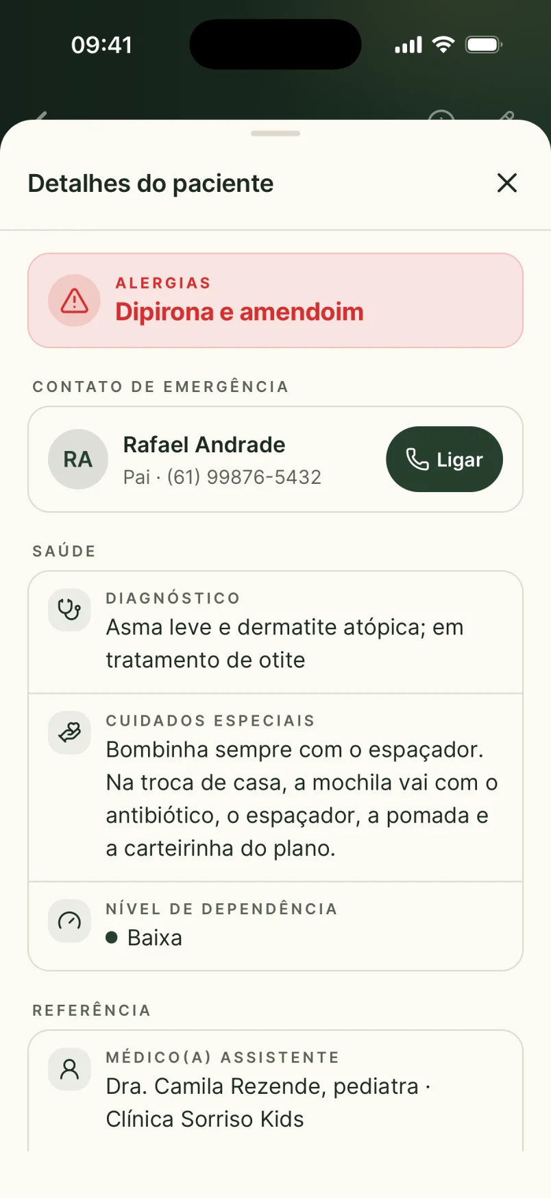
Sign-up was a fifteen-field form, with a dependency-level picker floating mid-screen and labels like “Type the allergies”.
The record became a reading card: allergies highlighted in red, an emergency contact with a call button, diagnosis and special care in short sentences. Data entry moved to steps, essentials first.
Before
After
03 — Prescription
Heuristic: Match between system and the real world
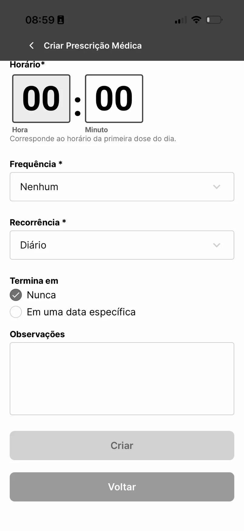
A prescription started in a technical form: a digital clock at 00:00, frequency “None”, recurrence, and a disabled “Create” button with no explanation.
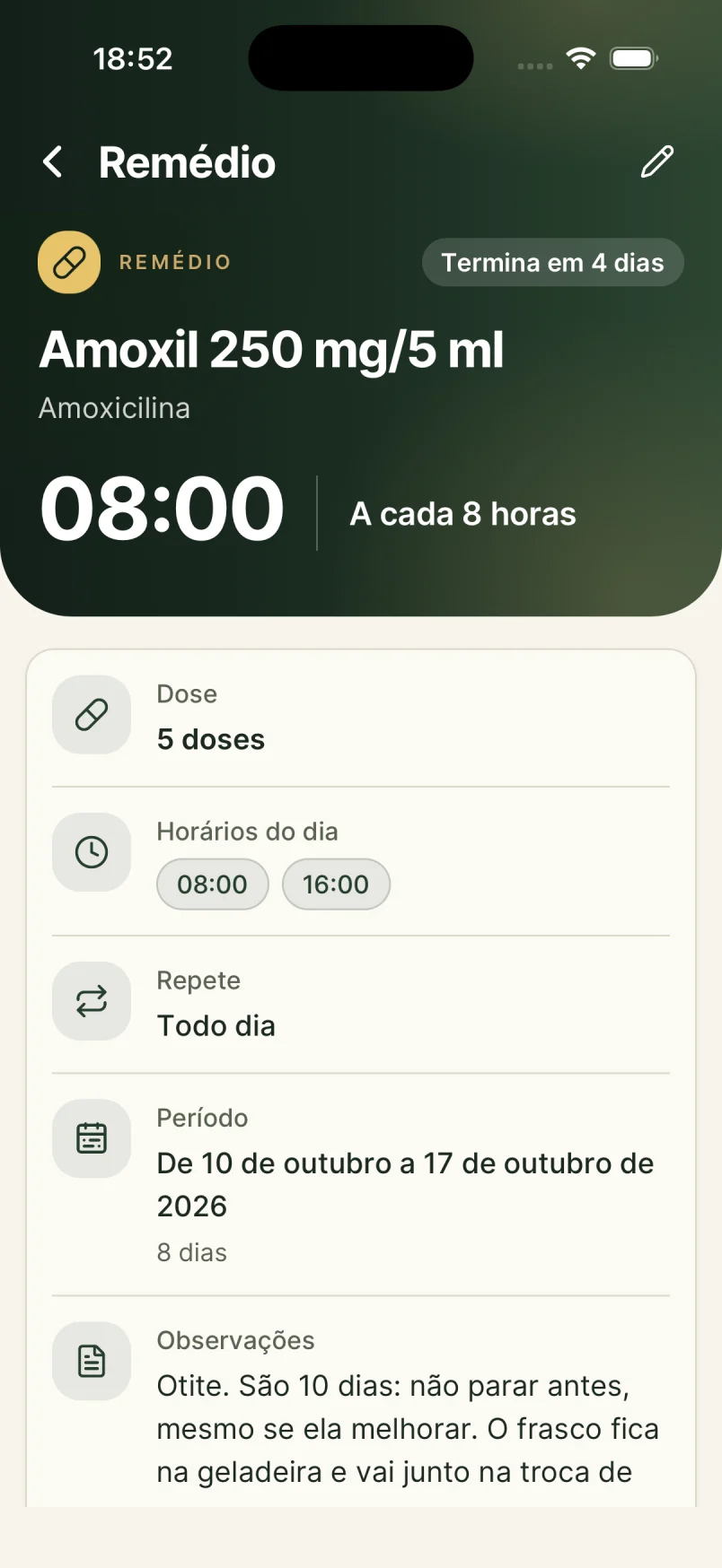
Now a medicine is a card the family reads like a prescription: name and dose, “every 8 hours”, times of day, a period with “ends in 4 days”, and the doctor’s note, including the reminder to pack the bottle for the custody swap.
Before
After
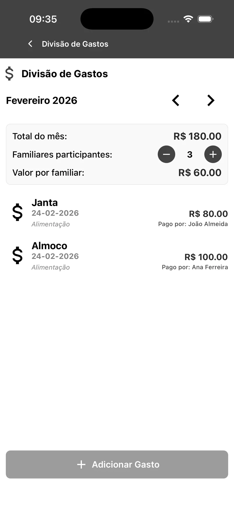
04 — Expense splitting
Heuristic: Visibility of system status
Before, the app split the total by a hand-picked number of people, with plus and minus buttons, and never said who owed whom.
Now it shows who paid, how much and each share, and works out the monthly settlement Tricount-style: “Mariana pays Rafael R$ 225.50”. Sharing care also means sharing the bill, without a spreadsheet.
Before
After
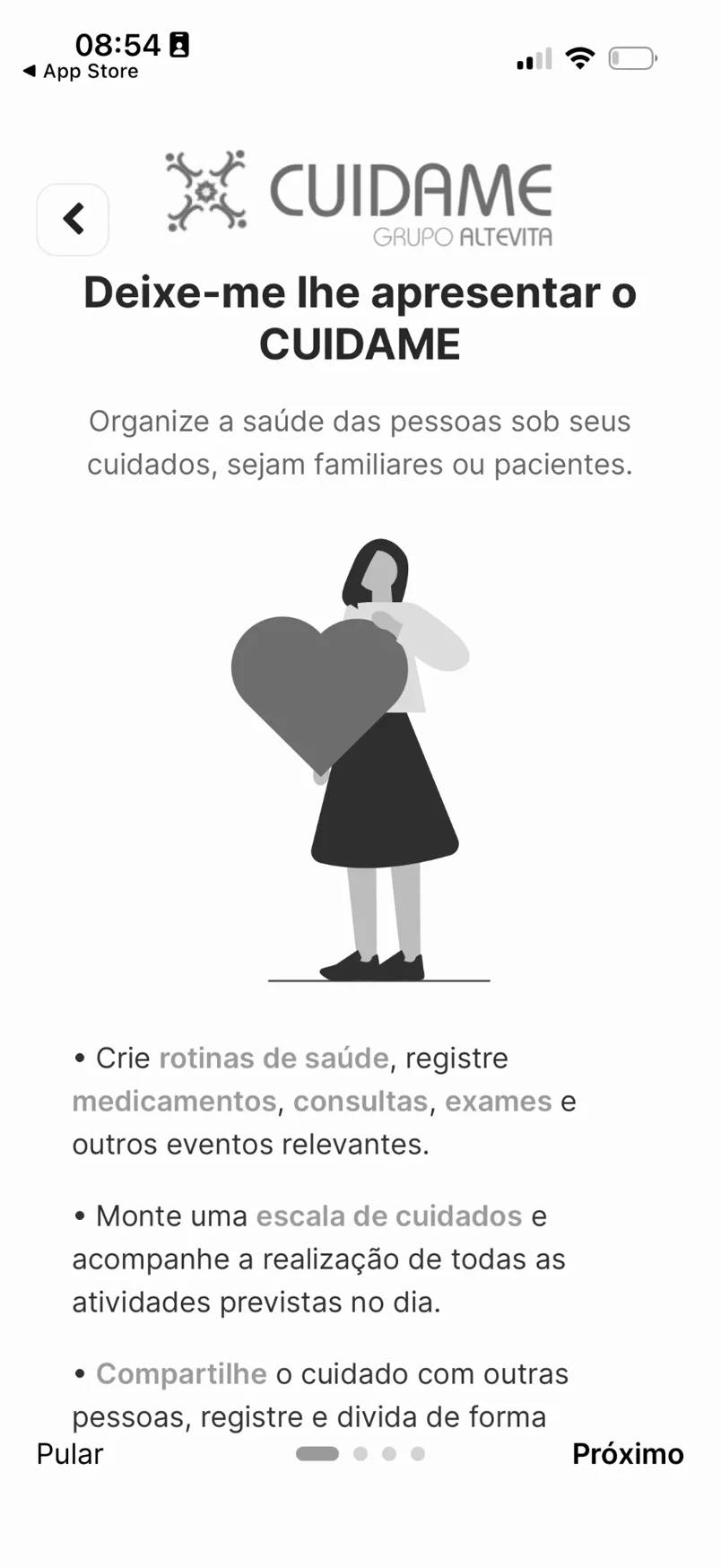
05 — First launch
Heuristic: Consistency and standards · aesthetics
First launch was four slides with stock illustration and running text to skip.
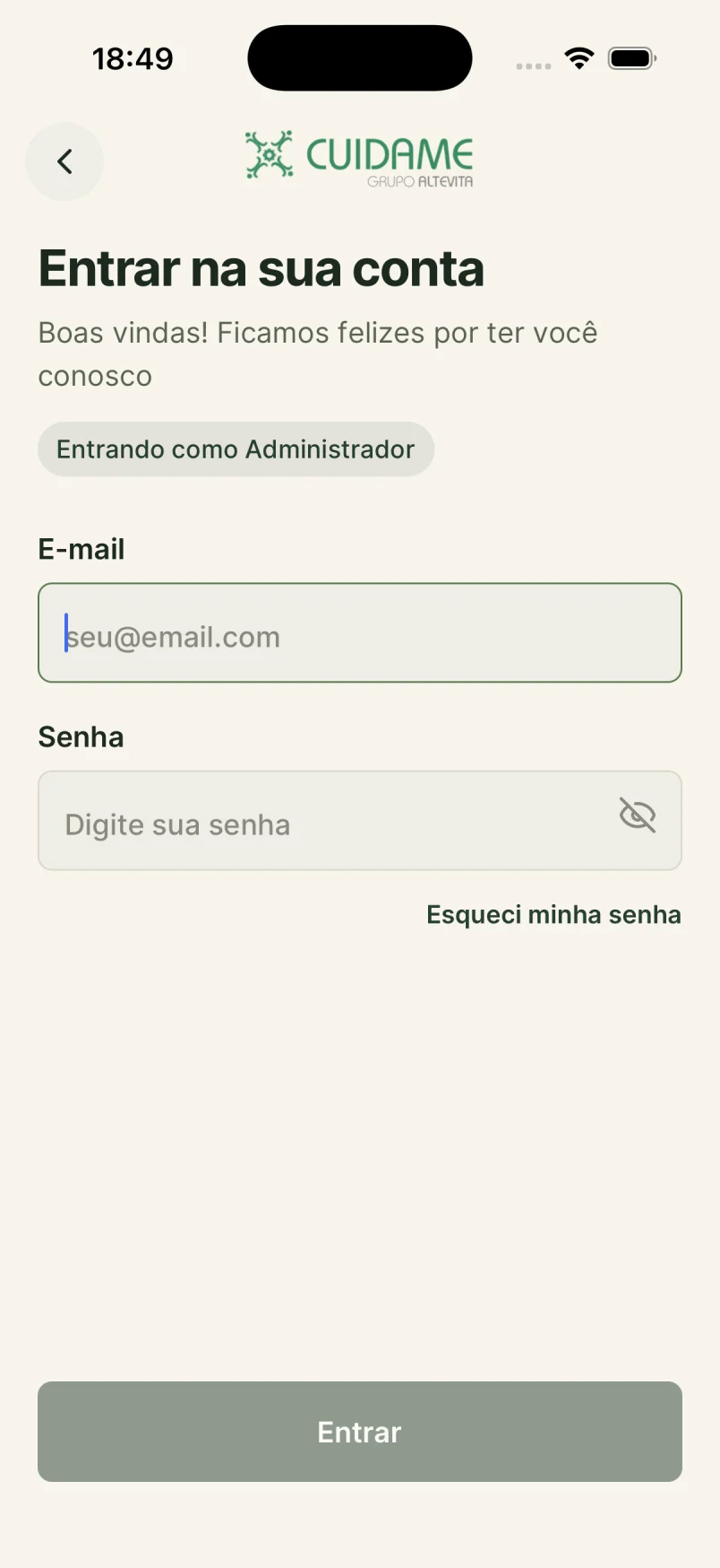
The new one opens with the brand, one sentence and two paths: “I already have an account” or “Create my account”. Less to read, nothing to skip, and CuidaMe’s identity from the first screen.
Before
After
06 — Help and modals
Heuristic: Help and documentation · user control and freedom
Help was a modal covering the whole screen, sometimes with a success toast on top, and a “More” tab that only offered Sign out and Delete account.
In the redesign, help moved into the screen itself: hierarchy, clear labels and quick access where it belongs. Nothing to dismiss before you start using it.
On either side of each pair, the app as published before the rescue, in black and white. Next to it, the redesigned screen.
05 — Outcome
From headed for cancellation to a new revenue stream
All of it in one week: mapping workshop, full redesign and 100% of the front end built, ready for beta testers. I did the work straight on the front end, cutting the handoff. What came out of design went straight to production — and the client approved it on the first try, after two years of never closing a single version.
A project that was about to be cancelled will now be commercialized by Altevita as a product of their own, a new revenue stream, and it opened the door to new projects together. A worn-down relationship turned into a partnership.
M
~ Mariana RubackM. R.+55 61 9000-0000
Bom dia
Que noticia maravilhosa
Beatriz, ficarei no seu aguardo sobre a sua percepção do app
09:23
B
~ Beatriz MonçãoB. M.+55 61 9000-0000
Bom dia, Wellington! Jóia e você?
Consegui dar uma olhada sim, achei que ficou bem completo e alinhado ao que a gente espera mesmo. Podemos agendar uma reunião sim.
11:54
B
~ Beatriz MonçãoB. M.+55 61 9000-0000
Boa tarde! Pelo vídeo, não identifiquei nenhuma necessidade de ajuste
12:34
Project WhatsApp group on the day the prototype was delivered. Names partially hidden; messages kept in the original Portuguese.
Results
What changed for the business
+From two years stuck (before me) to a prototype approved on the first try
+One week from workshop to a front end 100% ready for beta testers
+Scope simplified: company features cut, focus on the family
+App repositioned as a shared family care record
+A new Tricount-style expense-splitting module
+Design straight to production, with no handoff
+From headed for cancellation to a commercializable product, with new projects ahead
Stack
FigmaNavigable prototypeReactReact Native / ExpoTypeScriptNativeWindDesign System
Got a stuck project that needs unblocking?
I come in, map it, prototype it and ship it to production — until it is 100%.